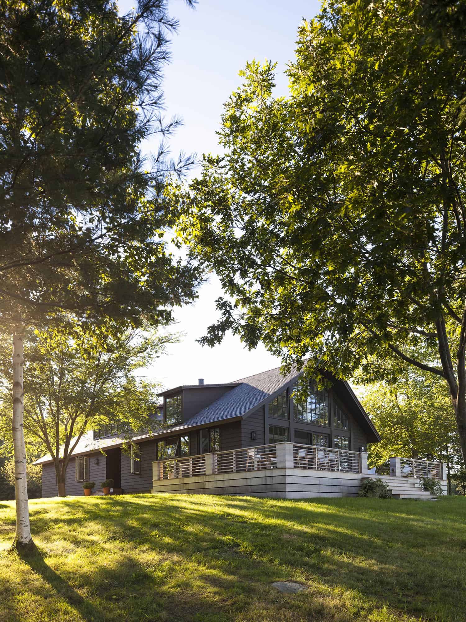
G.P. Schafer Architect completely transformed this stunning modern seaside home nestled on the water’s edge in Brooklin, Maine. The architect stumbled on this home by chance. Waiting too long to secure a summer vacation rental, there weren’t many options.
He came across this nondescript near-A-frame—built in 1992 and with almost no architectural character whatsoever—was all that was available and so he took it, planning to spend only a couple weeks there. The architect ended up falling in love with the extraordinary property. It afforded mesmerizing views across Blue Hill Bay to Mount Desert Island.
This idyllic property is set back from the sparsely traveled road and surrounded by several acres of woods. To his astonishment, this home also happened to be on the market! So with that, this classical architect purchased this 1990s near-A-frame.
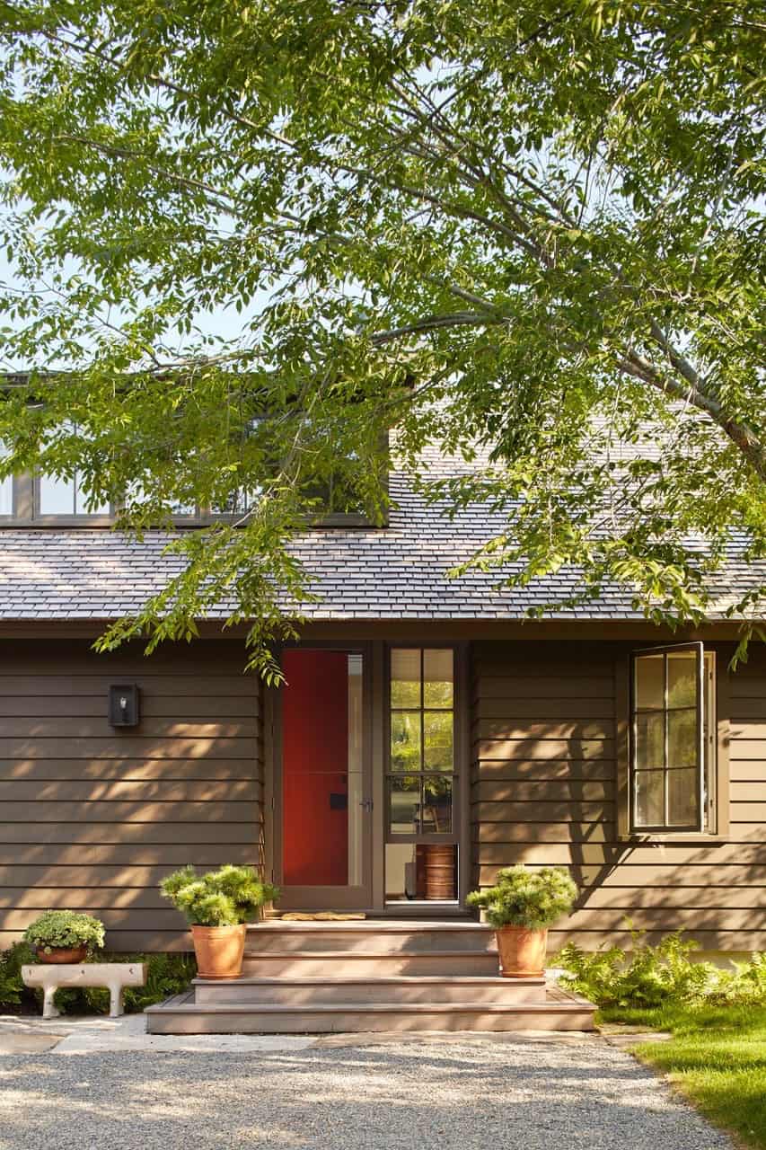
To make this house his own through the renovation process, the architect veered off what he is traditionally known for — Greek or Colonial Revival. Instead, his approach was a surprisingly modern house, yet still grounded on his ideals of scale, proportion, comfort, tradition—and memory.

What We Love: This seaside home is a beautiful mix of classical proportions reimagined with a contemporary twist. Designed with a timeless aesthetic, this home presents a feeling of belonging as if it was meant to be exactly where it sits on the site. Newly designed living spaces offer a harmonious flow while presenting a bright and airy feel. With breathtaking views from every angle, this is an idyllic getaway for gatherings with family and friends.
Tell Us: What do you think of this newly designed home? Do you think the architect was successful in creating a warm and welcoming living environment? Please share your thoughts in the Comments!
Note: Have a look at another home tour that we have featured here on One Kindesign from the portfolio of G.P. Schafer Architect: Charming countryside home in Mill Valley gets inspiring transformation.


On the interior, furnishings are a lovely collection of vintage midcentury modern, mainly American and Scandinavian pieces and casegoods. These pieces are mixed with antiques and new, custom fabricated pieces that add a sense of warmth, comfort, and inevitability to the entire house.


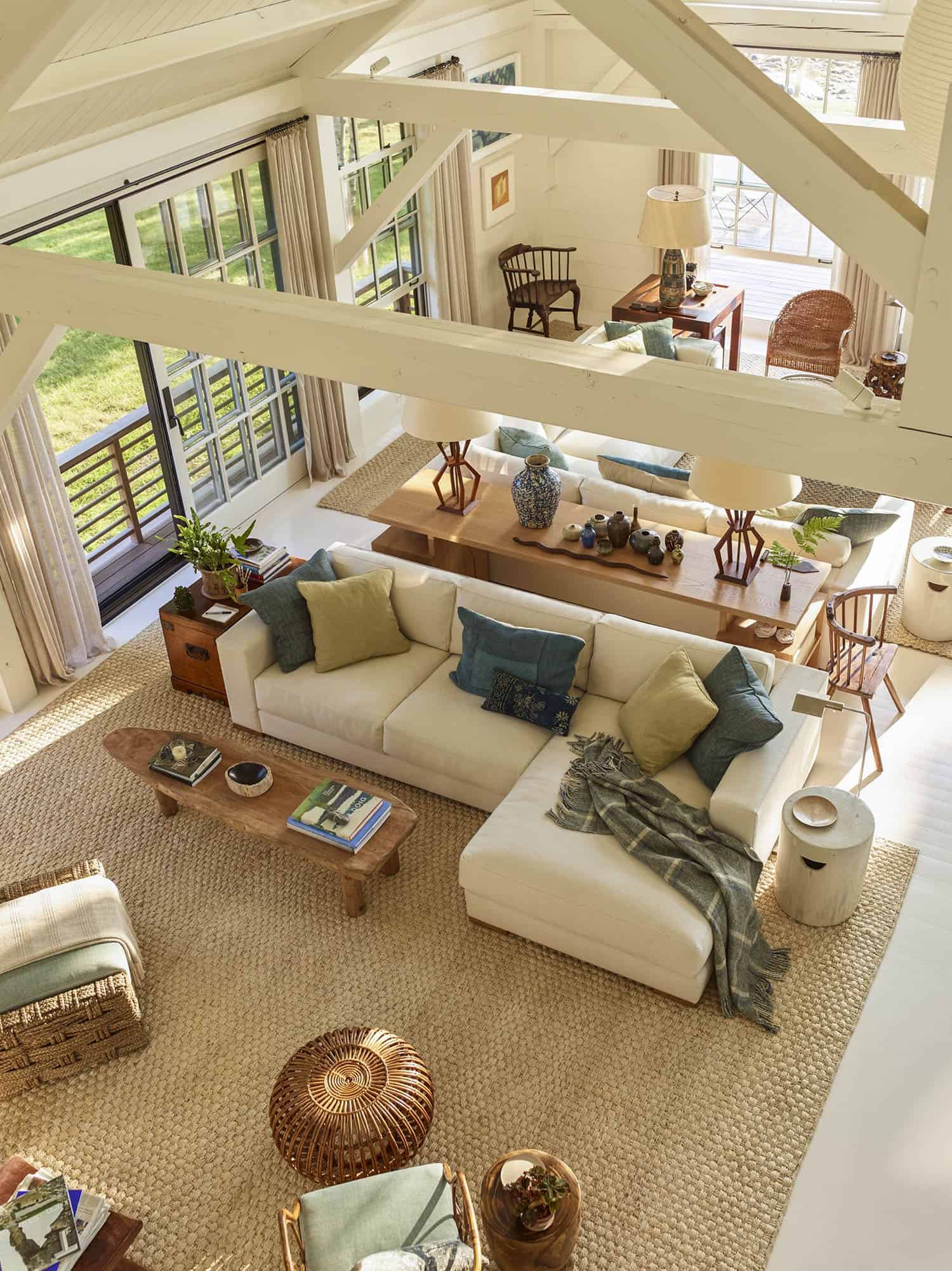
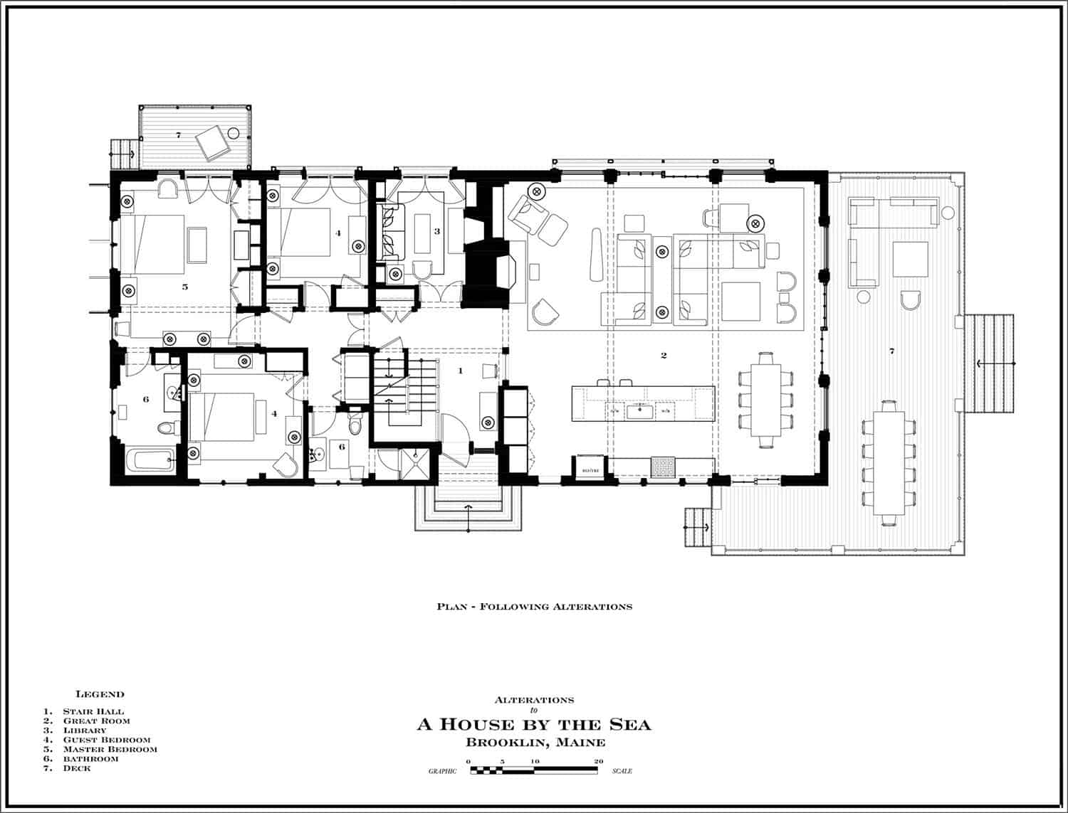
From this perspective, you can see that the great room is anchored by two groupings of furnishings. One is organized around the view of the sea for daytime use, while the other is focused on the preserved brick fireplace to be enjoyed for evening use. This furniture grouping creates a sense of intimacy in this spacious, barn-like setting. The eclectic mix of old and new pieces add to the timeworn aesthetic of this seaside home.


The open layout kitchen was relocated and reconfigured to be in harmony with the rest of the 30×30 foot great room. This space is perfect for lounging and entertaining, designed with large windows that frame sweeping views of Blue Hill Bay in almost every direction. The island and base cabinet countertops feature 2″ thick slabs of granite, quarried specifically for the room — perfectly evocative of Maine’s rugged coastline.

Above: Discrete, bronze bent-edge cabinet pulls were mounted on all of the kitchen cabinets in an elegantly abstract manner.
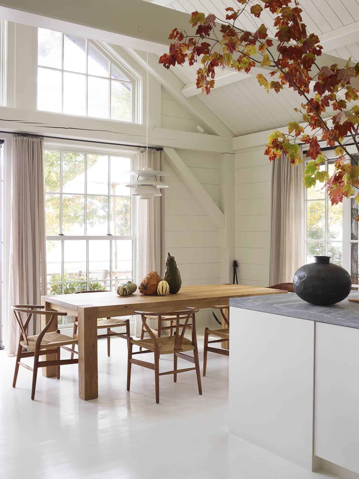

The architect integrated new, larger windows throughout this home to bring in more natural light into the interiors.

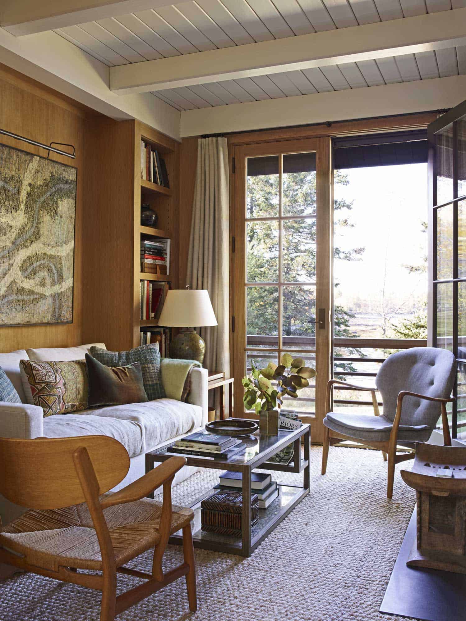
Except for the room pictured above, the original orange-stained wood walls were reimagined throughout. Walls, ceiling, and floors were painted in a creamy white hue — the shade has the subtle warmth of fresh milk. It was decided for this home that utilizing a white palette would be best for maximizing the effects of the magnificent Maine sunlight while accentuating the surrounding landscape.


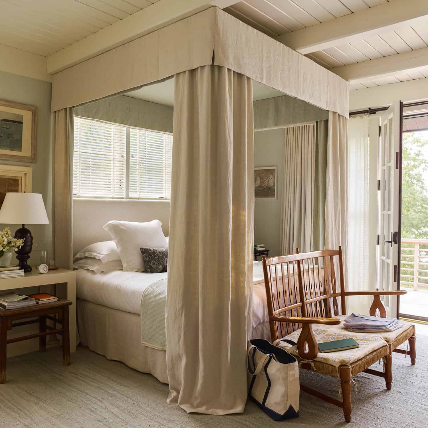


New dormer windows were added to the second level which created an organic space for a small study on the stair landing. A new guest bedroom suite was also integrated into this space, featuring a charming window seat. This idyllic space for perfect for curling up with a good book while gazing out over the bay.


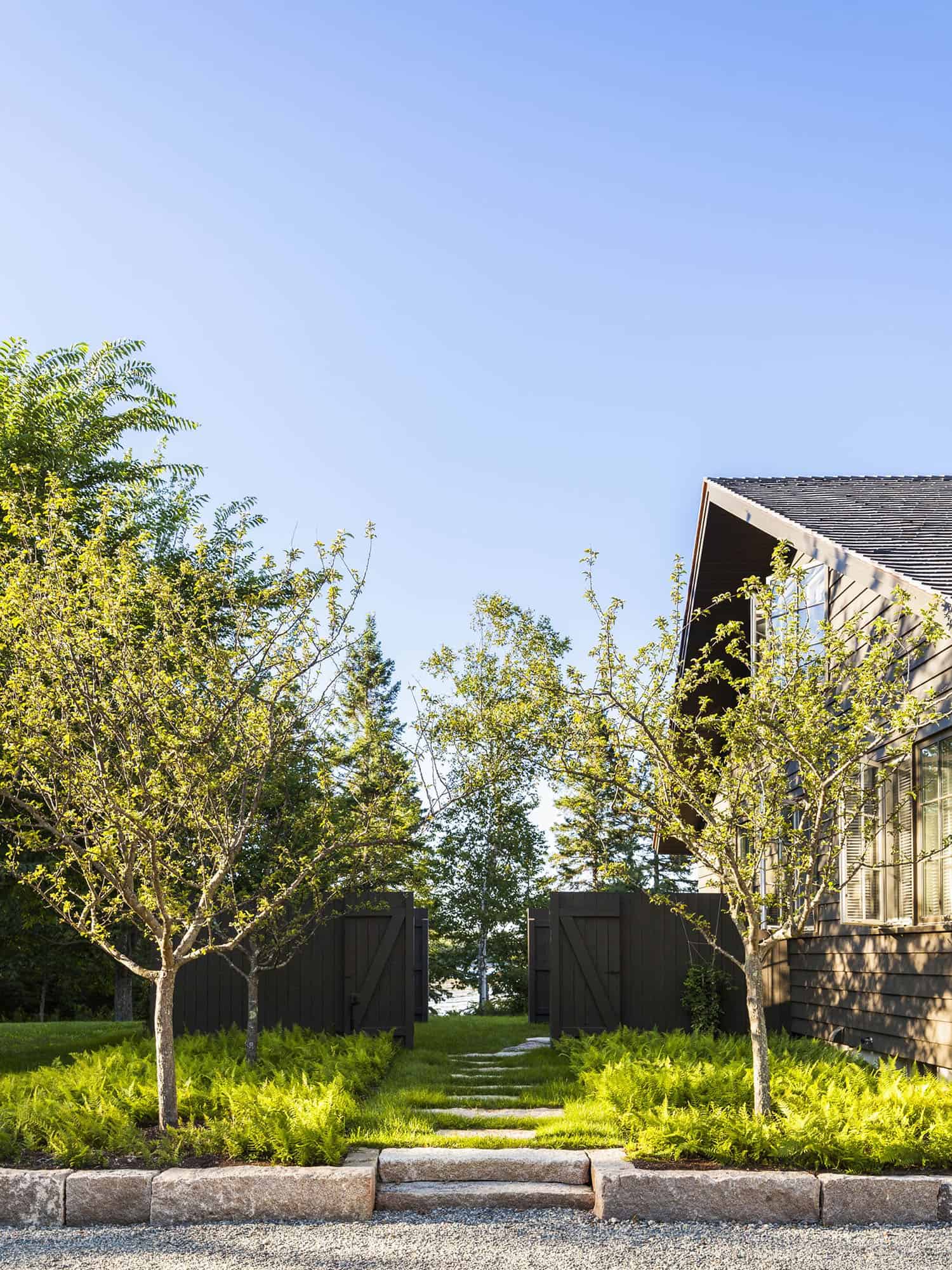
This seaside home was re-clad in wide-plank, clapboard siding and painted in a deep piney-olive green, melding into its surroundings. “The new deck railings—which mirror those inside the house—are a subtle nod to the area’s nautical past, with their ship-rail inspired design,” states the architect.
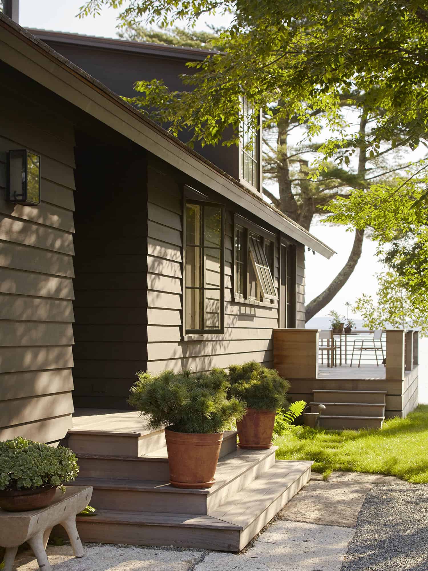
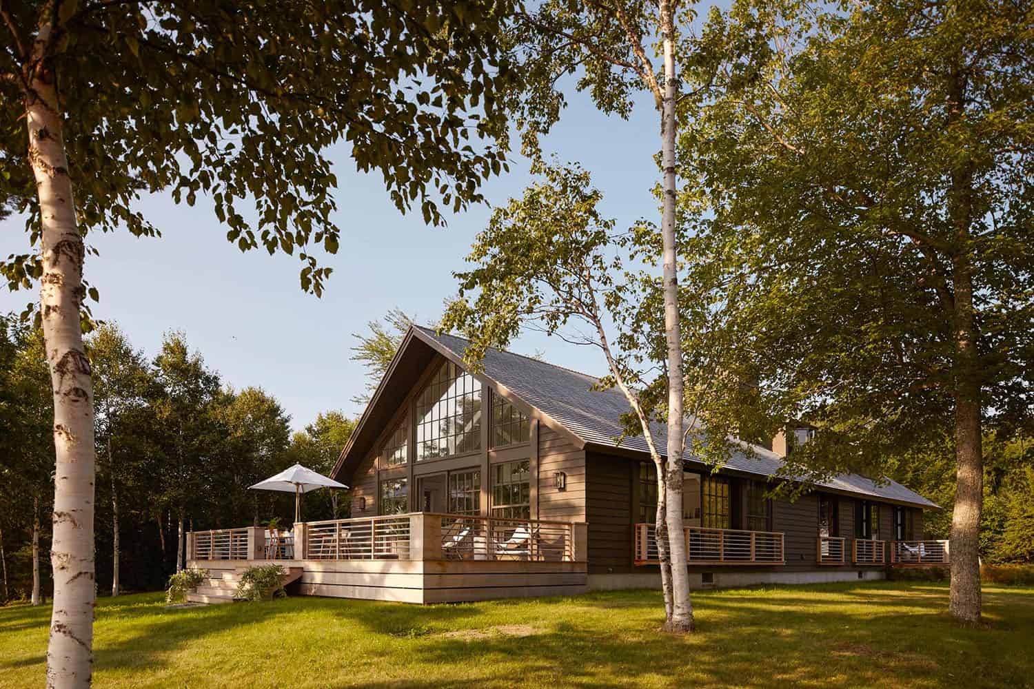




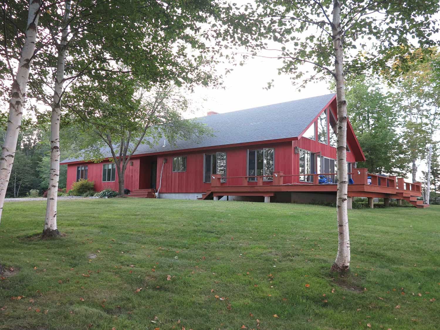
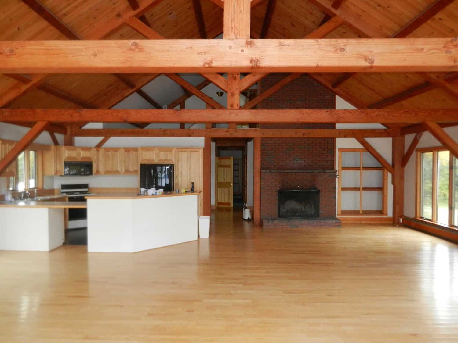
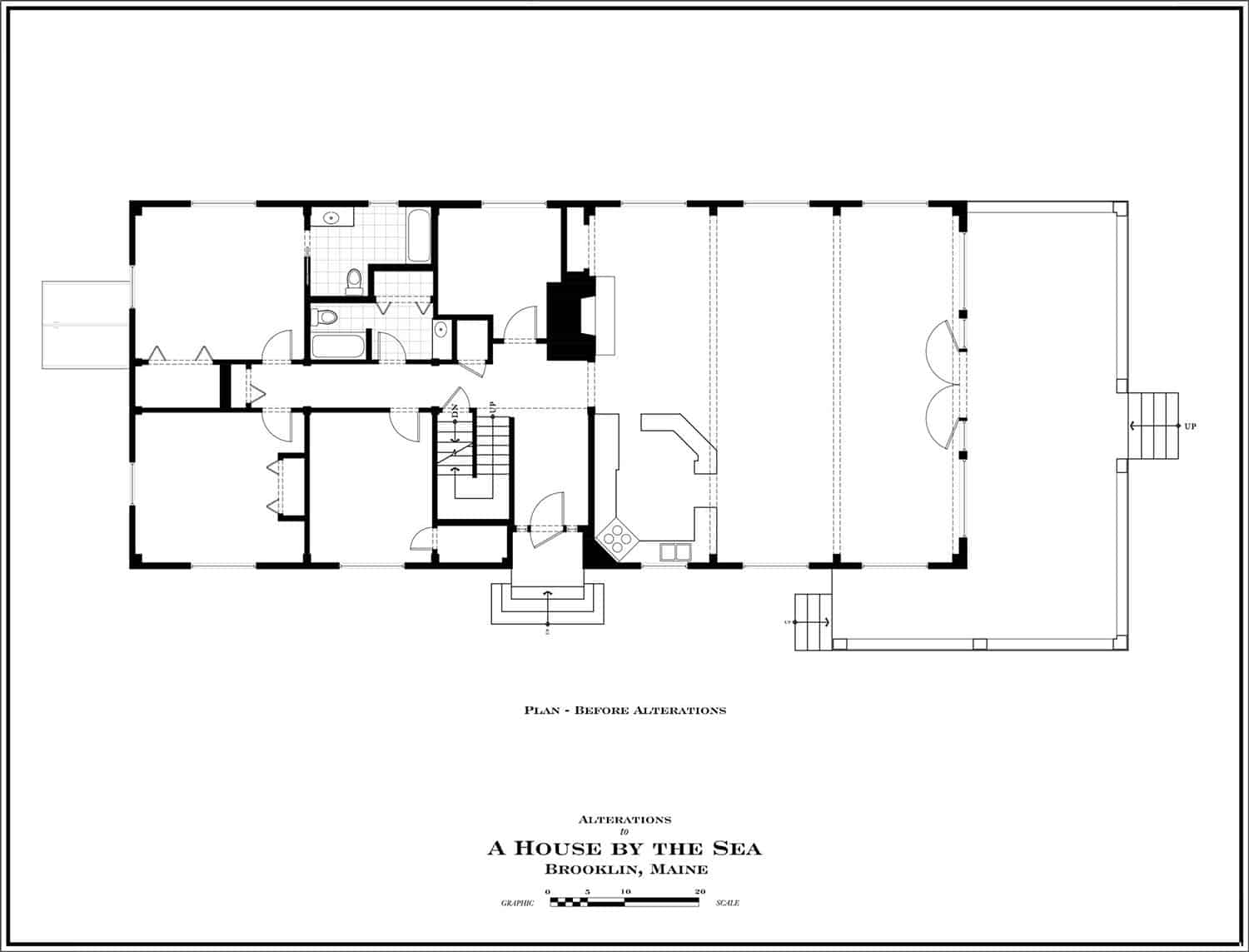
BEFORE THE RENOVATION:

Photos: Courtesy of G.P. Schafer Architect






1 comment