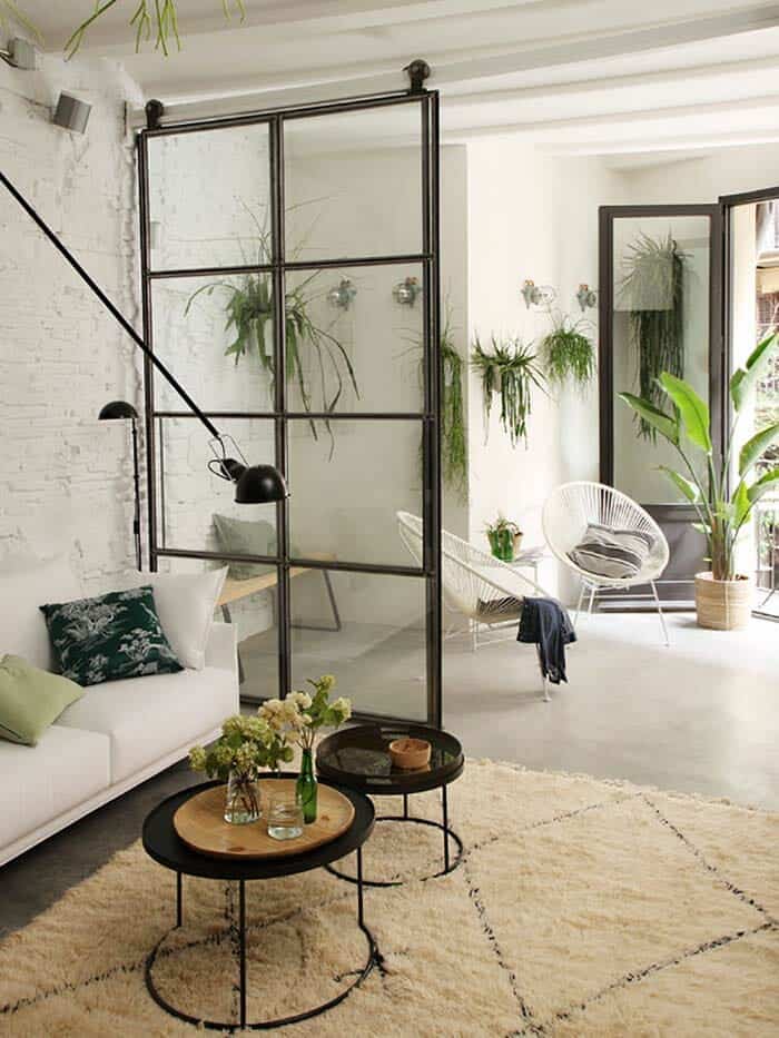
This beautiful early 20th century apartment features a bright and airy transformation by interiors firm Roura Studio, located in Barcelona, Spain. The homeowners are Martín and María owners of Livin’it Barcelona, a company that specializes in giving a second life to unique homes. The renovation not only sought to restore the essence of the apartment, but also to revalue the beauty of the original architectural elements with contemporary solutions and designs.
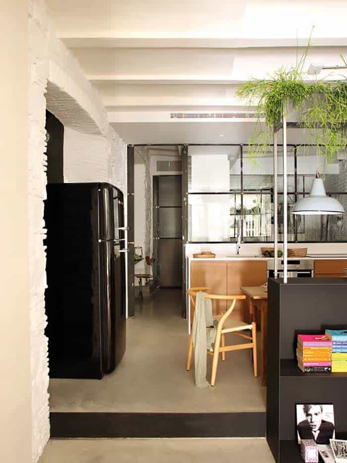
Above: The hall of the house opens directly into the living room. The passage between both environments was established through two sliding leaves. This solution allows to unite or separate spaces at will and brings natural light to the interior of the house.
The homeowners gave complete creative freedom to the designer, while also contributing their ideas throughout the renovation process. The small apartment was in very bad condition and the project was complex. The homeowners wished to create a diaphanous space with different environments. Contrary to interventions that hide the beauty of the original materials or the uniqueness of traditional architectural solutions, the distribution was not affected.
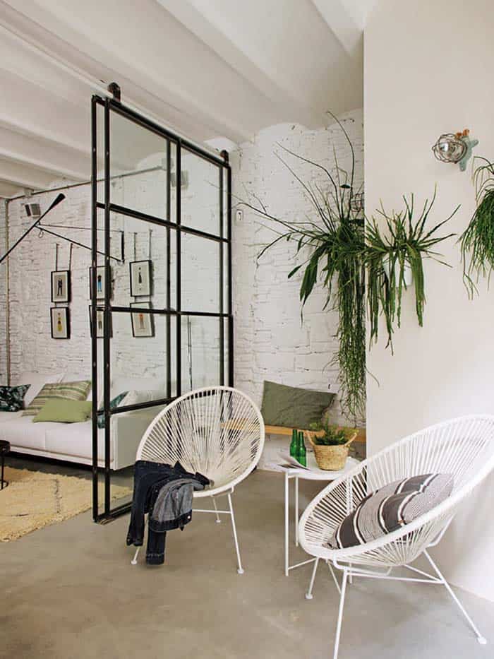
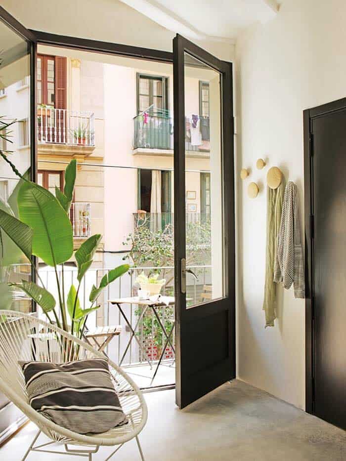
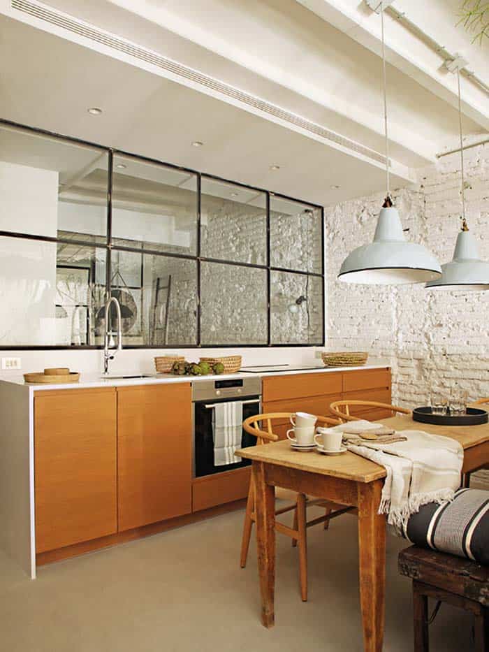
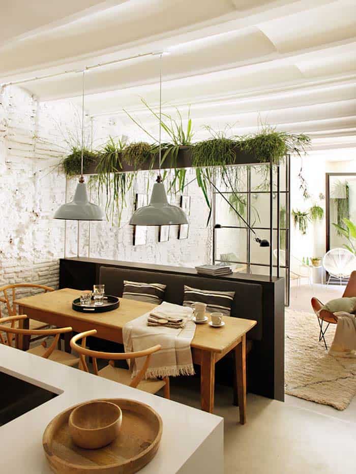
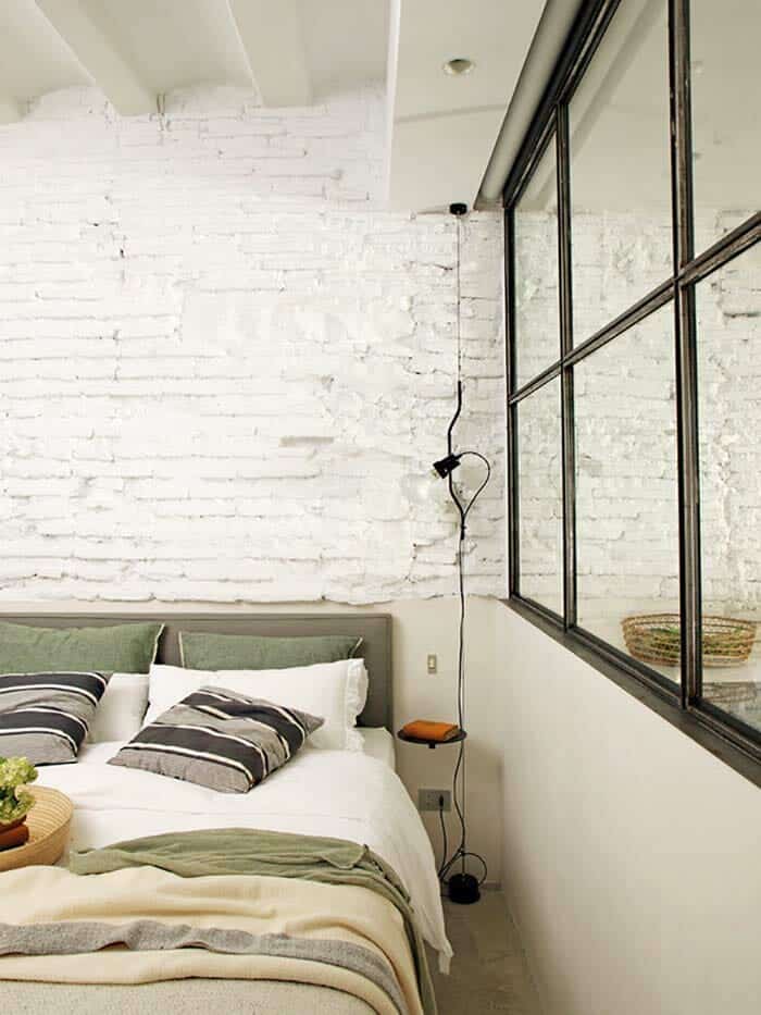
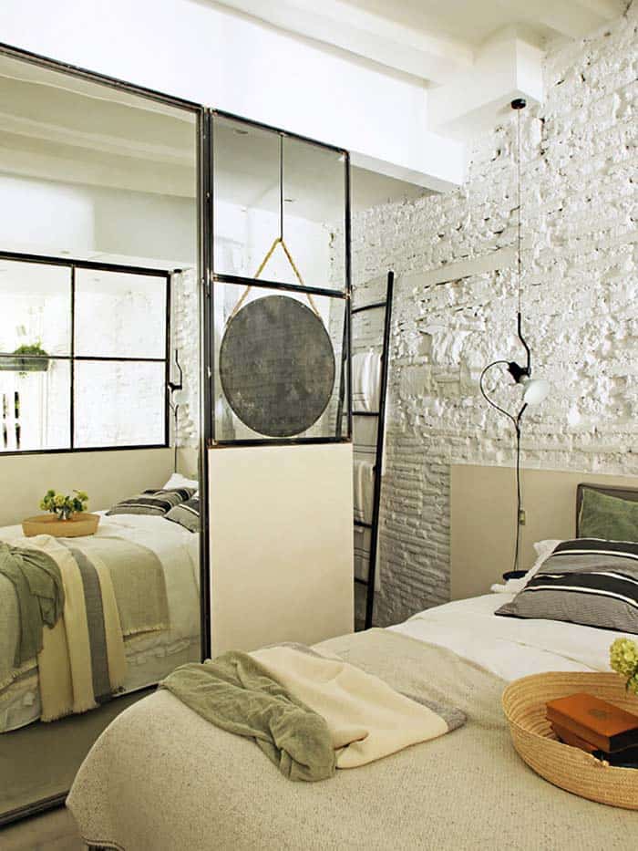
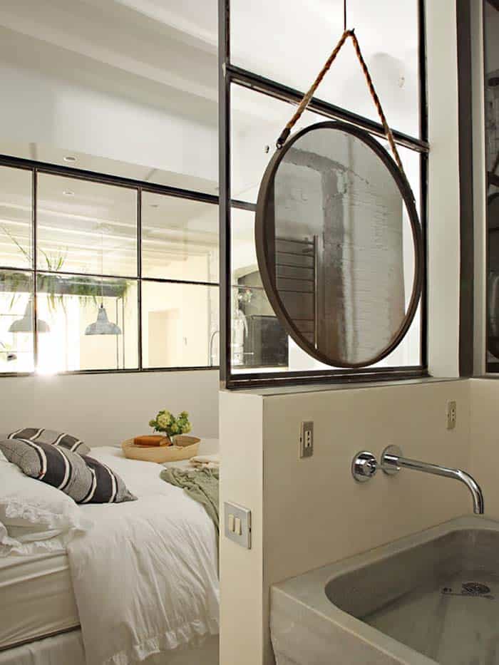
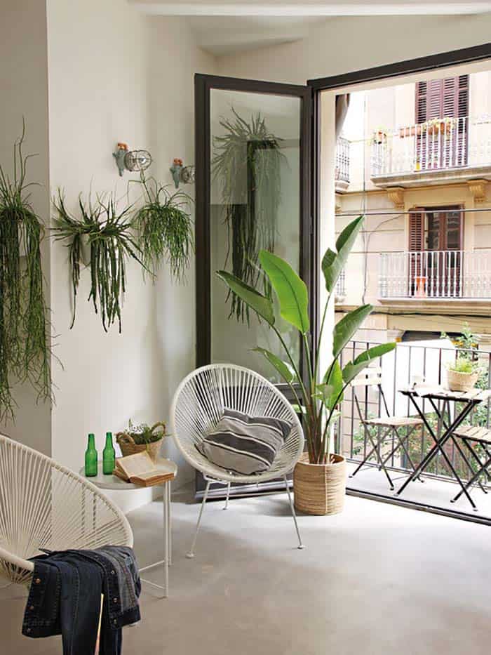
Glass partitions were installed that offer visual communication and allow natural light to flow through the interior spaces. The glazed enclosures, designed by Roura, with black iron profiles, were key in the interior design project. “By having only a small balcony, we invented a veranda and a large window visible from the entire floor,” states the designer, who loves to use plants to give life to spaces.
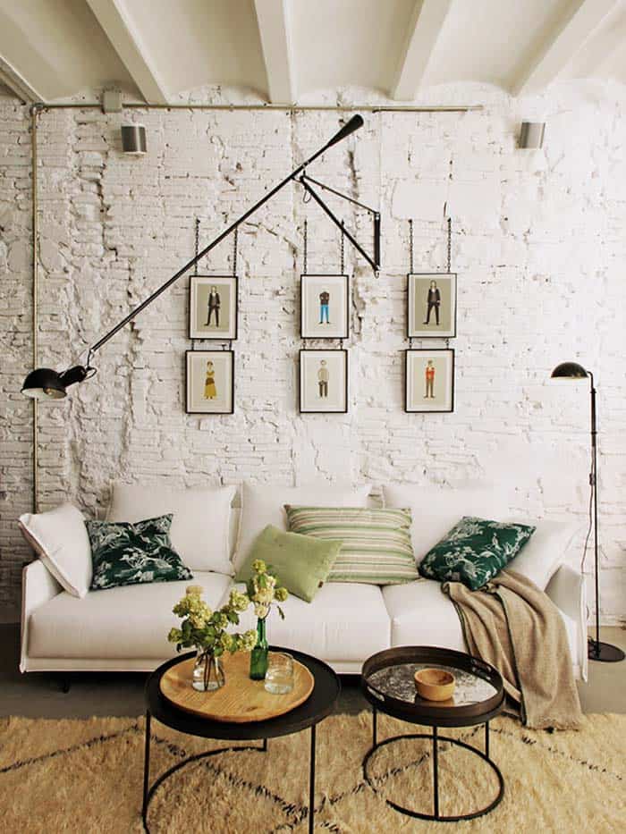
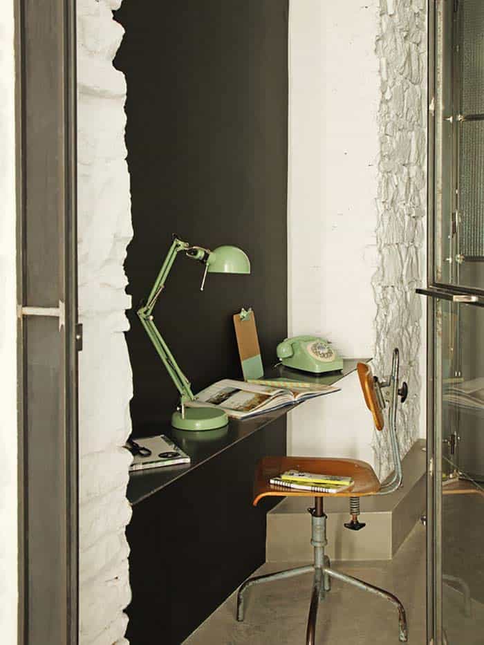
The vaulted ceiling, exposed brick walls and window frames were restored; the facilities were conditioned, the pine flooring was replaced by polished concrete and the smooth fronts were painted white, except in the work corner, where black slate paint was chosen. The decoration, with well chosen pieces—some of them, design icons—created the finishing touch.
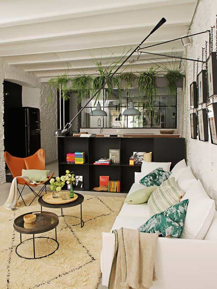
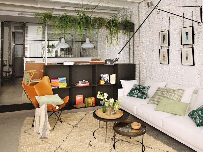
What We Love: This small apartment renovation offers a fluid distribution between interior living spaces. Low-height furnishings are used to delineate the living and dining room, while effectively creating a visual flow between the spaces. We love how these design decisions have helped to keep this compact living environment feeling open and spacious. The white painted exposed brick walls and high ceilings helps keep the interiors feeling light and airy.
Readers, what are your thoughts on this apartment renovation? Do you feel like you could live comfortably in this home or do you find it not spacious enough? Tell us in the Comments!
Photos: MiCasa




0 comments