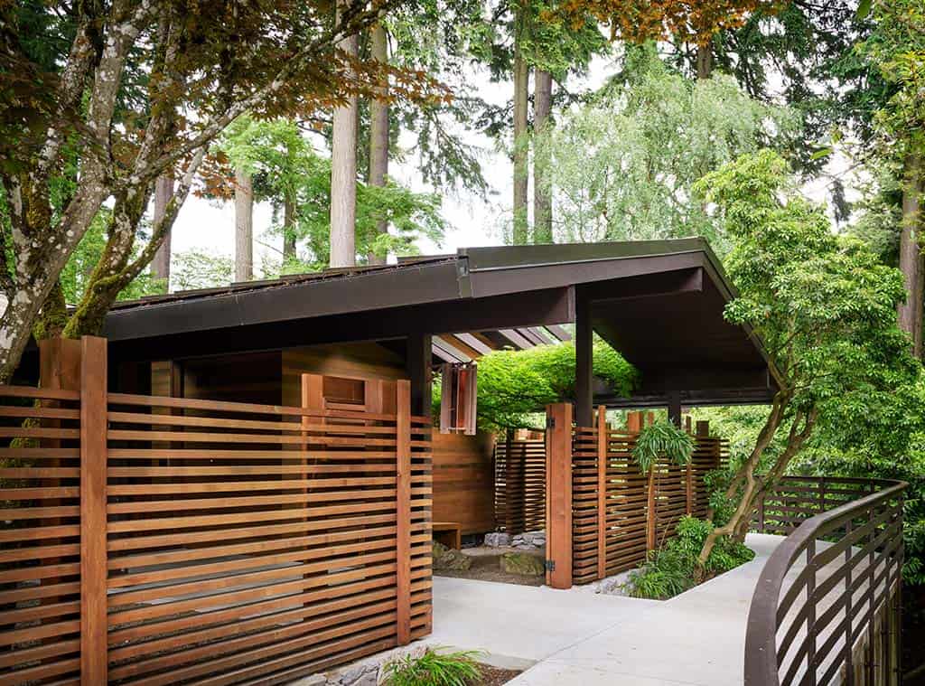
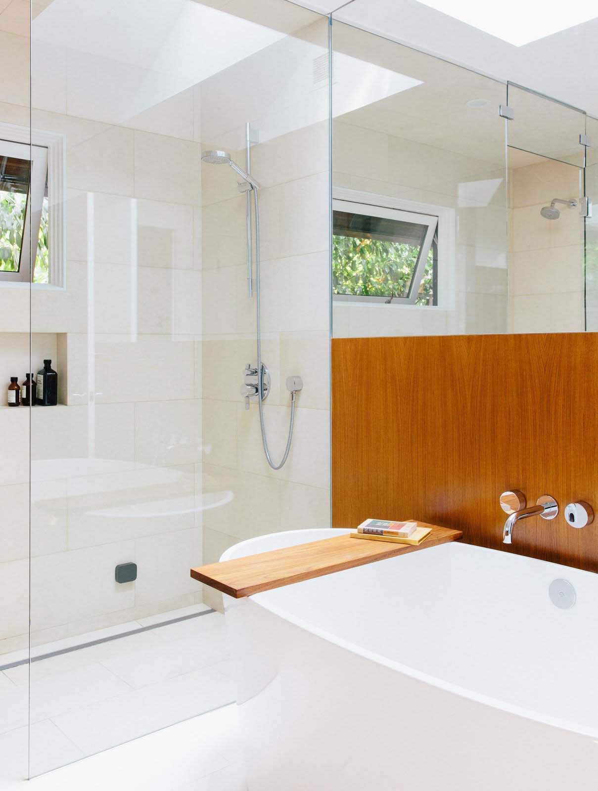
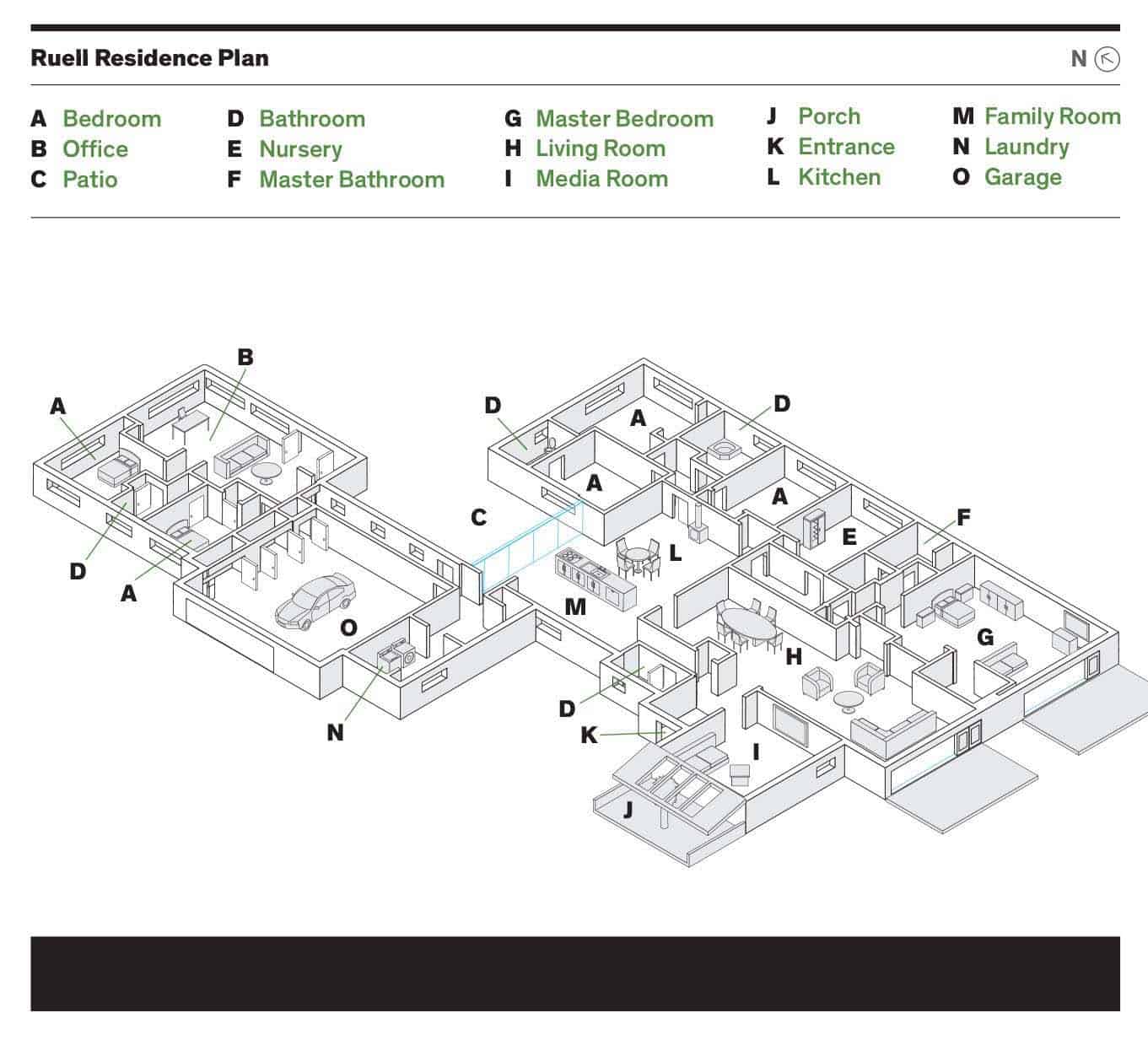
Jessica Helgerson Interior Design was responsible for a complete interior overhaul of a mid-century home located in Portland, Oregon. The 4,300 square foot residence was originally designed in 1959 by local architect William Fletcher. In respecting the history of the home, architect Dale Farr, William Fletcher’s former partner, was commissioned to help work on the home. The architect designed a garage addition and an addition to the front of the house.
Prior to the current homeowner’s possession of the home, it was owned by an artist. During the design process, the design team kept in mind both the style of the dwelling as well as the playful eye of its previous inhabitant. The new homeowners are also artists, who possesed their own strong aesthetic. The renovation resulted in a melding of styles, with the personality of the homeowner’s shinning through.
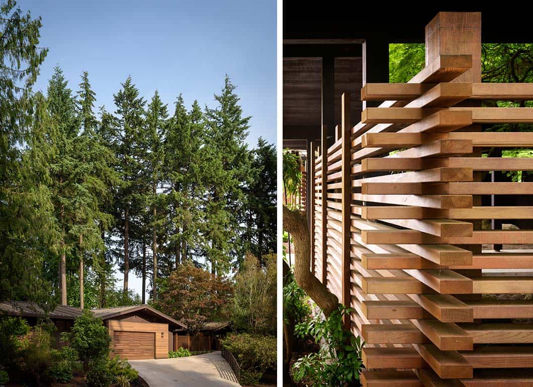
The home was designed to meet the lifestyle needs of a family with four young children. There are plenty of areas both indoors and out for the family to interact with each other and for the children to roam. The home itself is tucked under a grove of mature growth fir and cedar trees. Nestled on a suburban landscape, large expanses of glass invites both nature and natural light inside. The exterior facade is characterized by a heavy use of wood and generous overhangs.
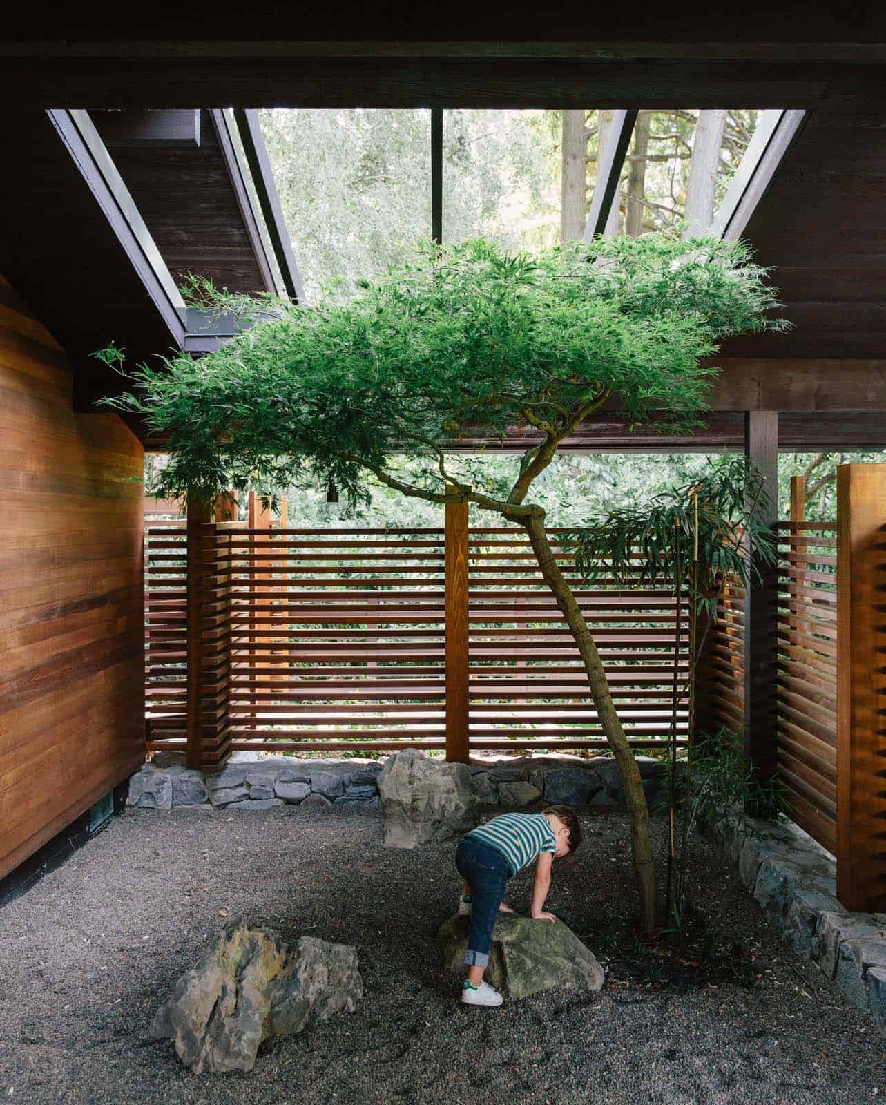
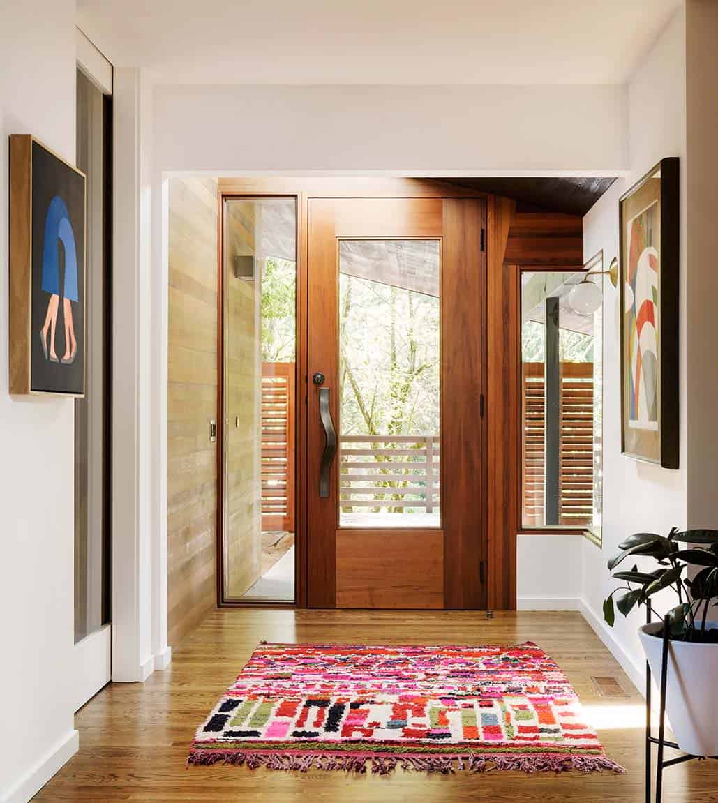
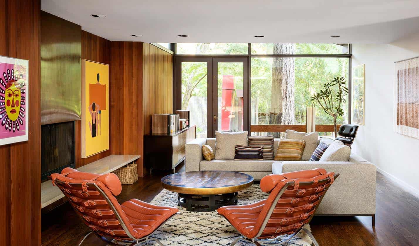
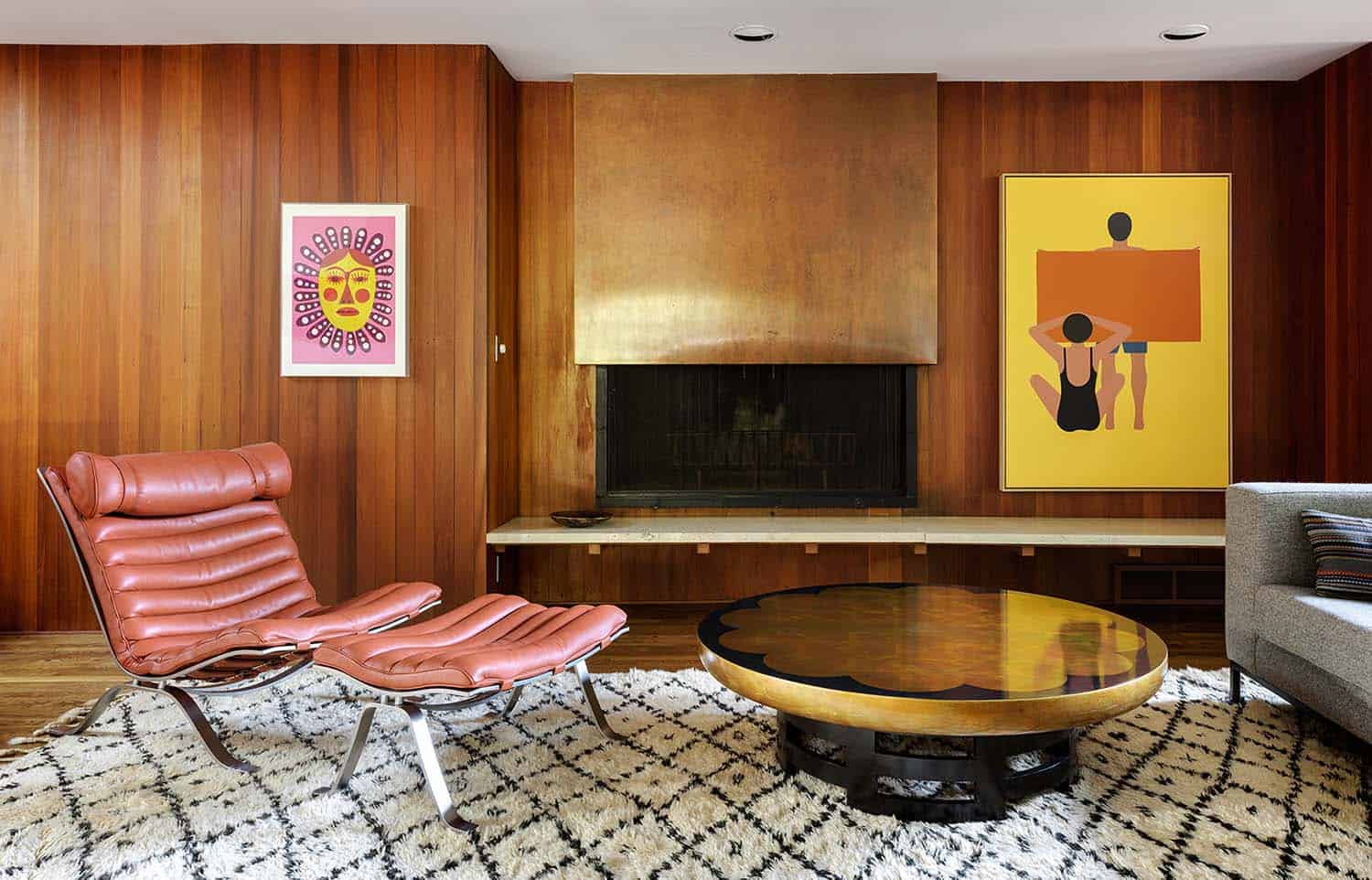
The front entryway features a trellised porch, that is very inviting and a fantastic outdoor space for the children to play. The interior living environment reflects mid-century pieces mixed with more contemporary furnishings, a layering of textured fabrics, bold colors and vivid artwork. Throughout the home, Kolbe windows and fixed glass (in existing jambs) were added to maximize energy-efficiency.
What We Love: This mid-century modern home is bright and airy thanks to expansive windows and an open plan design. The bright pops of color and bold artwork throughout the interiors adds a playful feel to the spaces. A mix of vintage and contemporary furnishings and accessories brings character to the home, while material and design elements respects the history of this home’s brilliant past… Readers, please share your thoughts on the overall design of this home in the comments below!
Note: Have a look at a couple of our recent home tours from the mega-talented portfolio of Jessica Helgerson Interior Design: Barn-like house gets striking transformation in Santa Ynez and Public library transformed into fresh and inviting home in Portland.
Interesting Fact: The homeowners used to reside in L.A. for 10 years, before deciding the area was not a good fit for their lifestyle. She was a film editor before leaving to raise children, while he was a director and photographer. He also has an acting credit to his name, Kip—the brother in the movie Napoleon Dynamite.
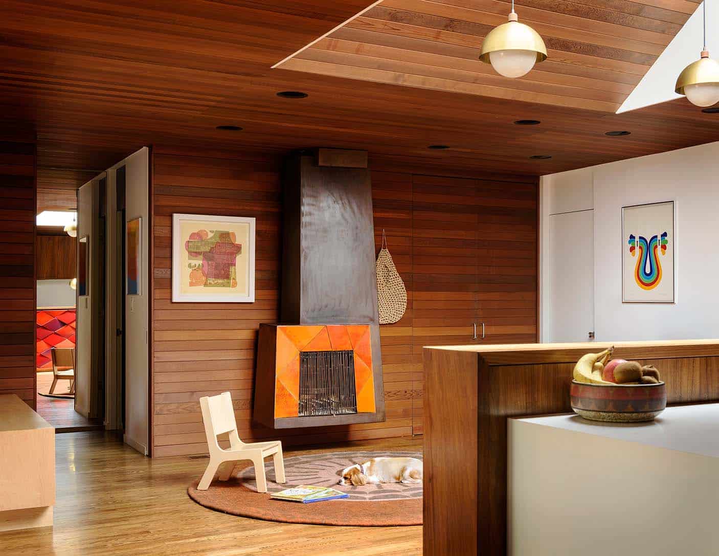
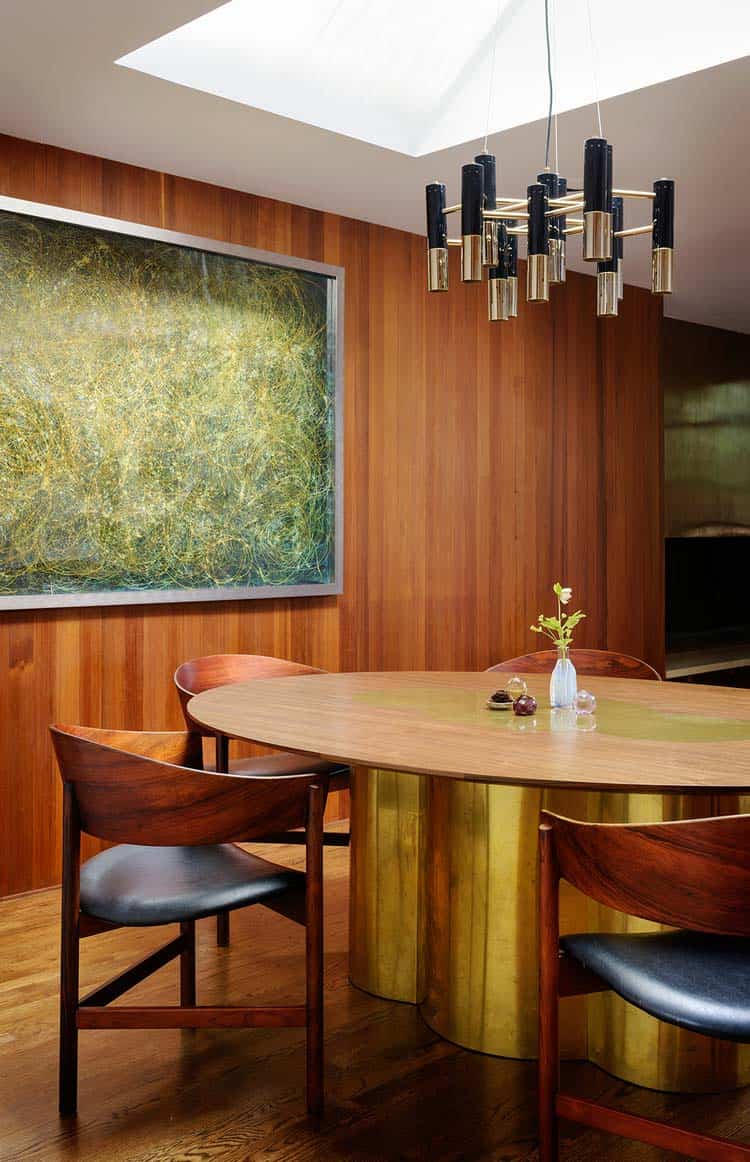
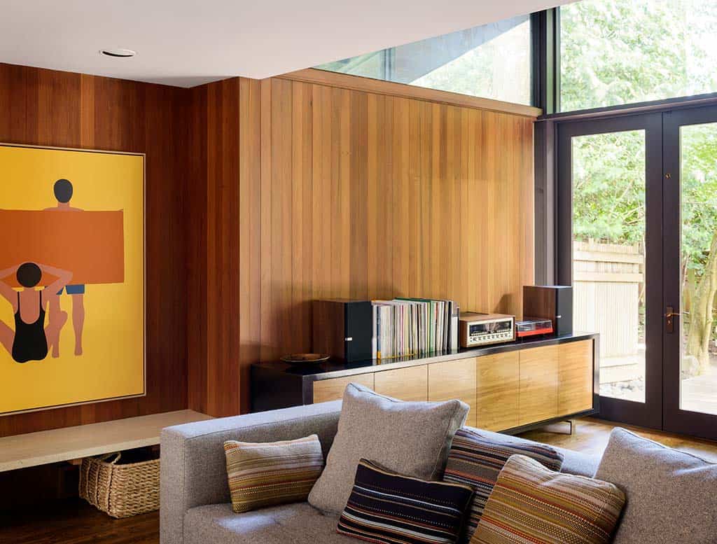
Above: Cedar-panelled walls respects the architecture of the home’s past.
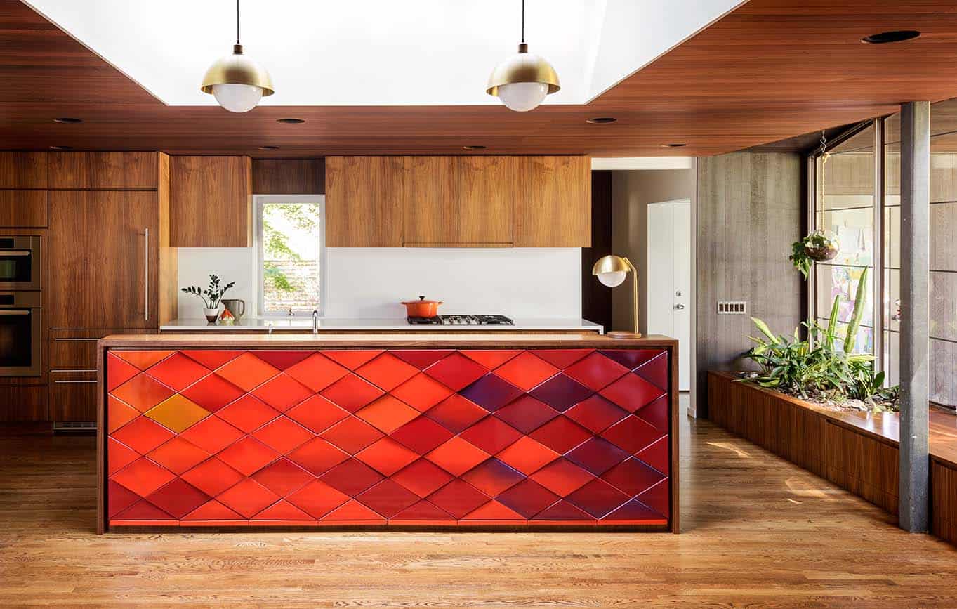
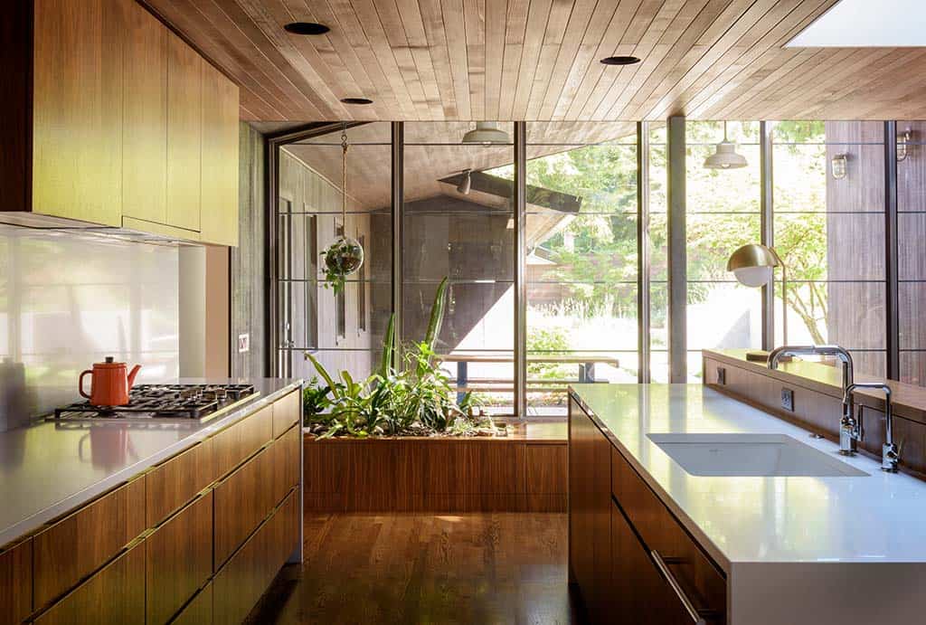
Above: The kitchen features flat-sawn eastern walnut cabinetry (previously purple laminate), complimented by PentalQuartz countertops in polished Super White. Both the cooktop and oven are Miele. The designer’s preserved the original red tiles on the island.
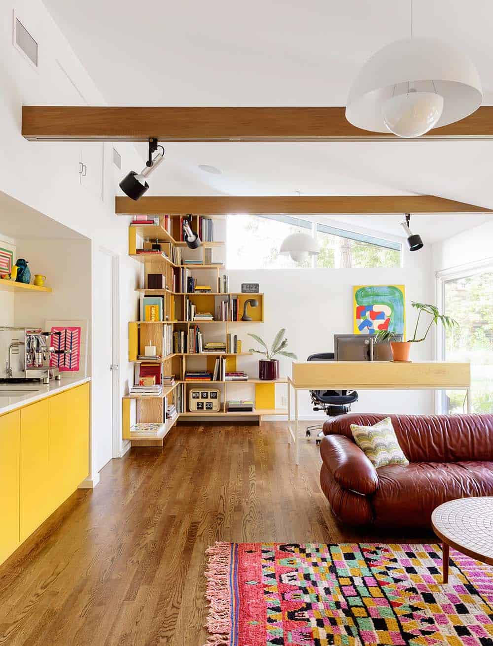
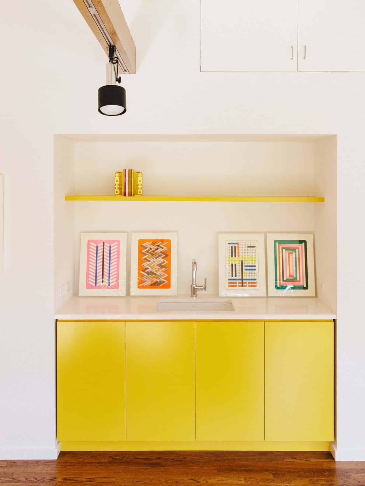
Above: In the home office, track lighting illuminates bright, canary yellow cabinetry. The color is Lemon Bar by Miller Paint.
Above: The master bedroom was designed by the couple to fit with their personality and style. They selected a new red carpeting, which was inspired by what was originally there. The light fixture illuminating the space is the Half Moon pendant by Allied Maker.
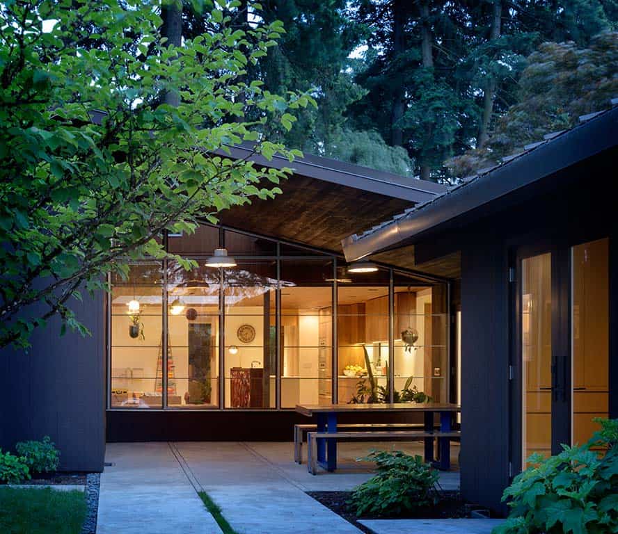
Above: A concrete-walled courtyard is painted in Black Bean Soup by Benjamin Moore, a color that is in keeping with the period of the original architecture. The original roof shingle were rotting, so the architect replaced it with dark metal standing-seam panels. The architect also added a media room off the front entryway to accommodate a 50-inch television. A total of 350 square feet was added to the residence.
Photos: Aaron Lietz








1 comment