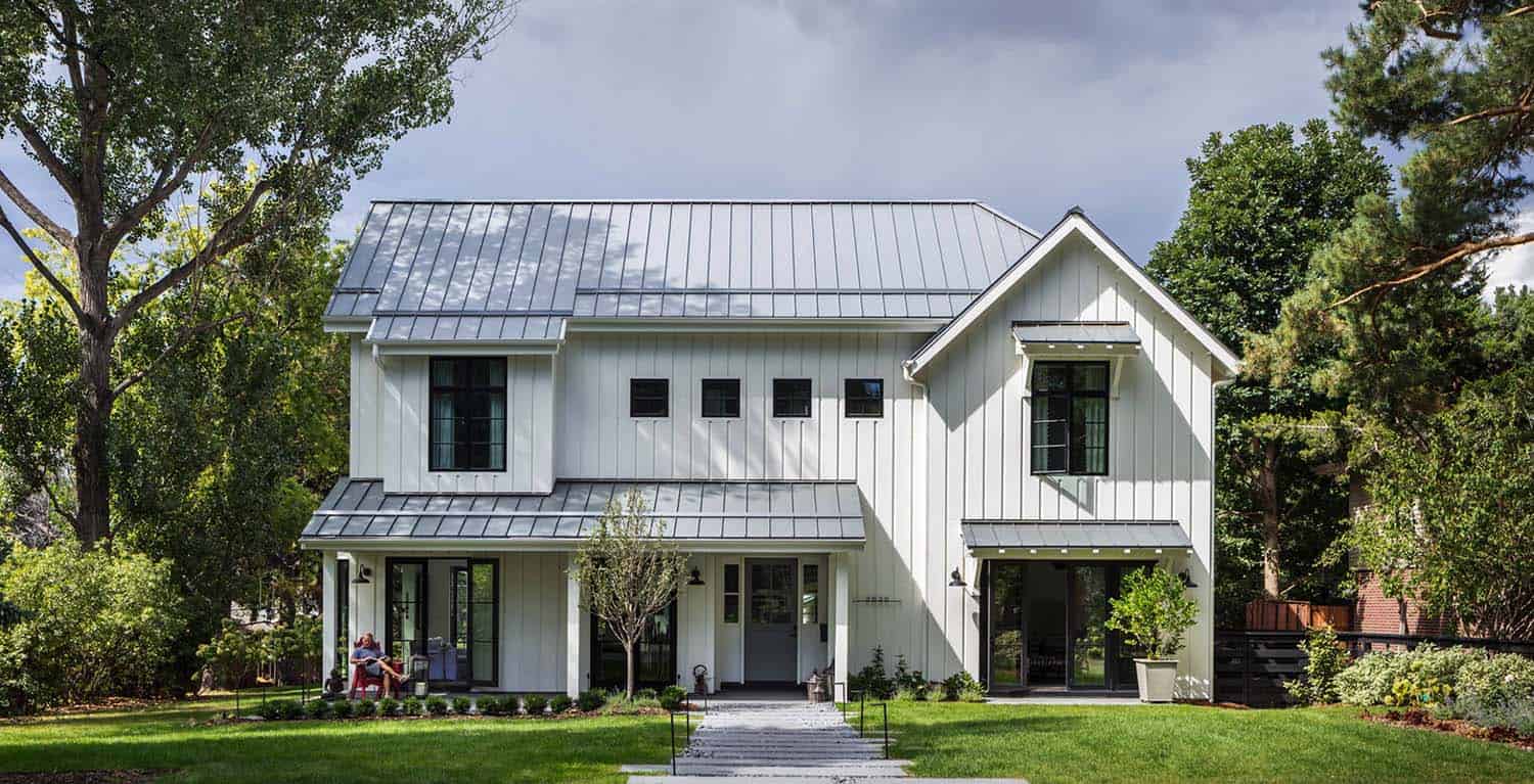
This Napa Valley inspired farmhouse was designed for a family of five by Hentschel Designs, located in Observatory Park, a suburb of Denver, Colorado. Elegantly styled, this 5,000-plus-square-foot house took its architectural cue from the homeowner’s many visits to Napa Valley. The open living concept is a key to quintessential California living. The first challenged the homeowner faced was to renovate a charming yet dilapidated farmhouse that was existing to the property.
After working with the project team on the redesign, the architect make the executive decision to start from scratch. The homeowner’s vision could not be created in a redesign. A new plan entailed honoring the charm of the previous home, while reclaiming some of the original elements into the home. This included doors, light fixtures and wood from an old fence. Larsen Development was responsible for building this new home.
Project Team: Architect: Hentschel Designs / Builder: Larsen Development / Interior Design: Studio R Design / Design Consultant: Scout Interiors / Landscape Design: Elevate by Design / Landscaping: Browne & Associates Custom Landscapes / Flooring: Scandinavian Hardwoods
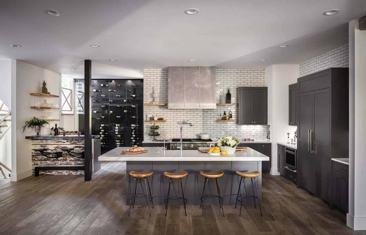
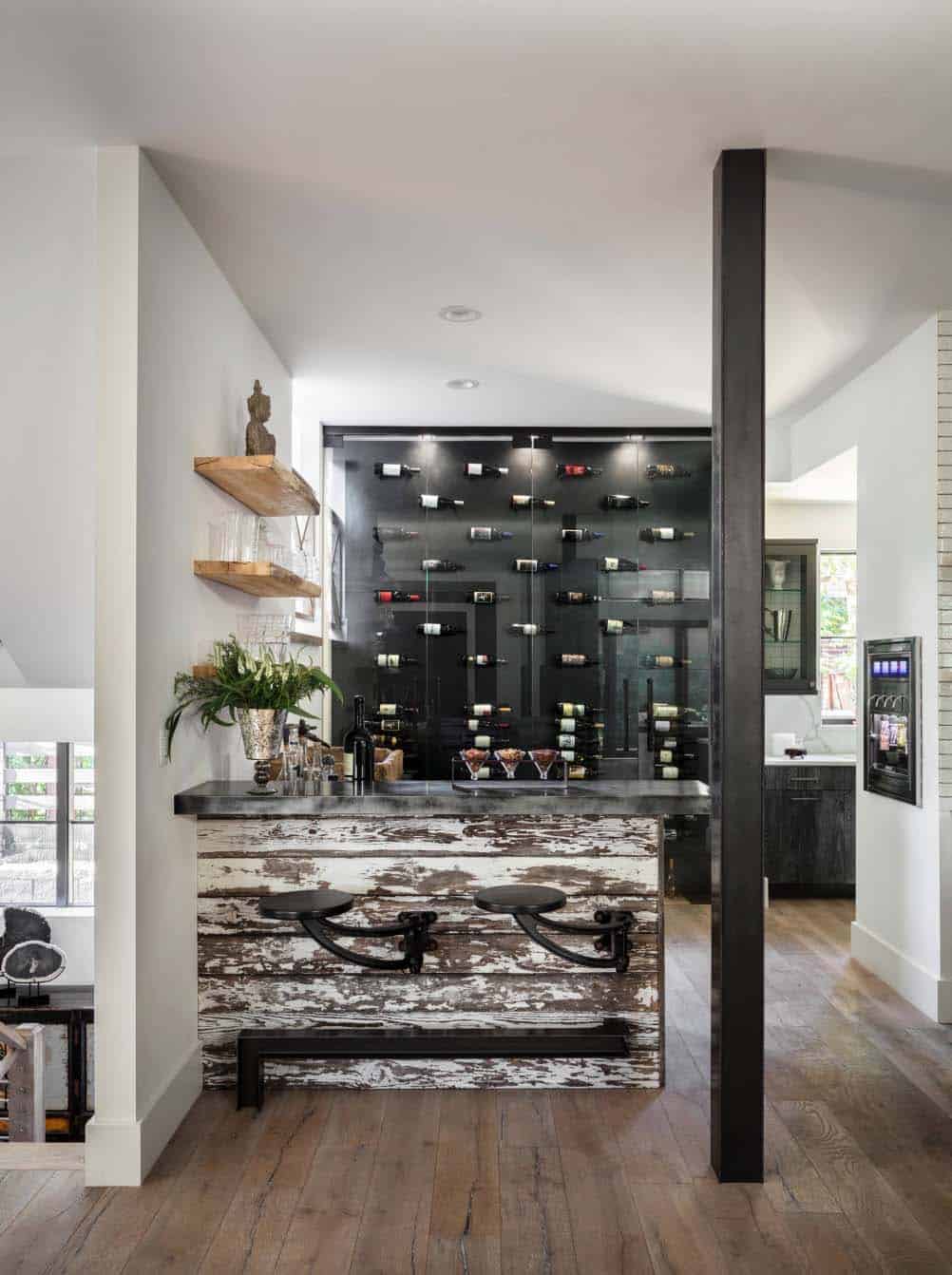
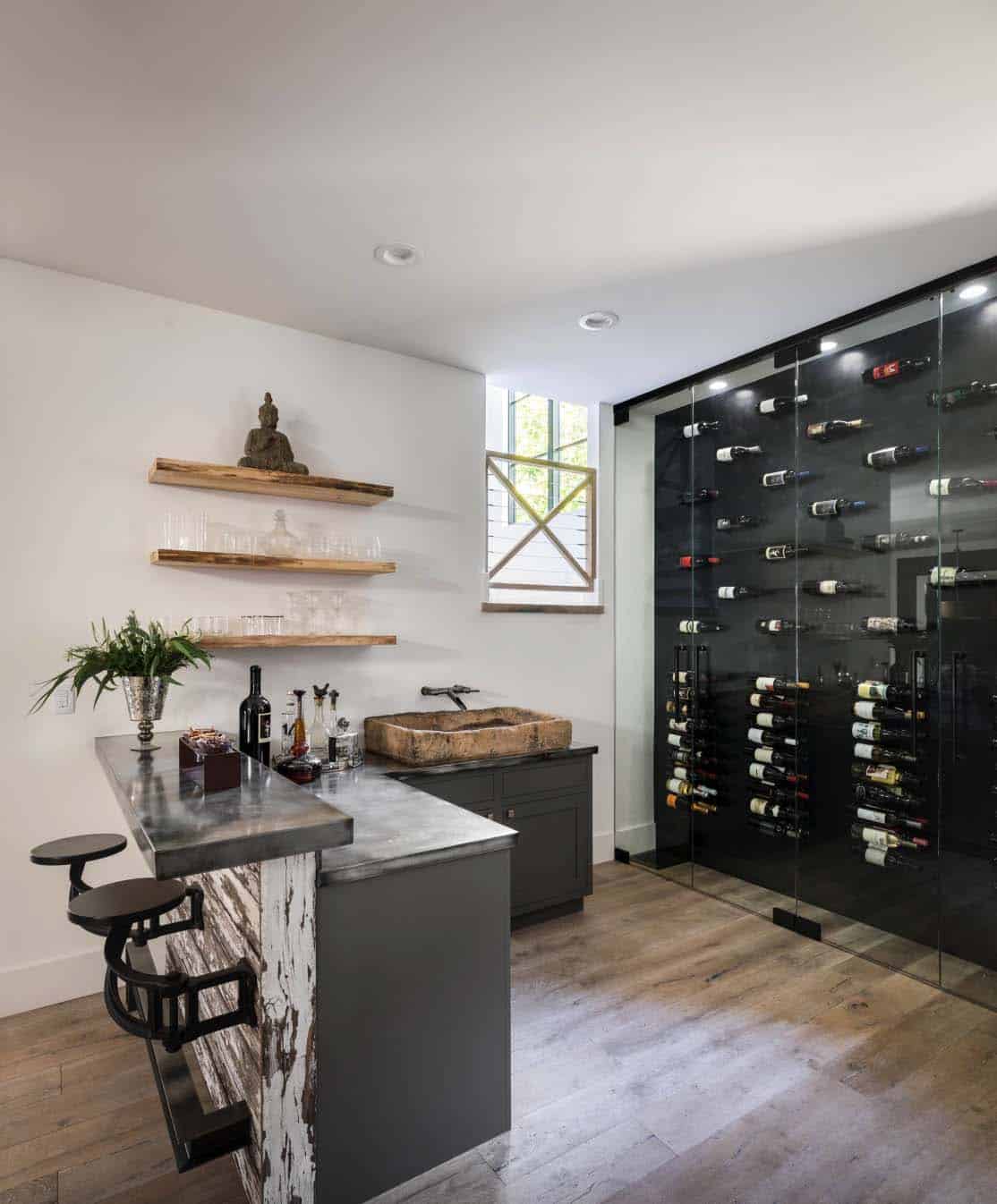
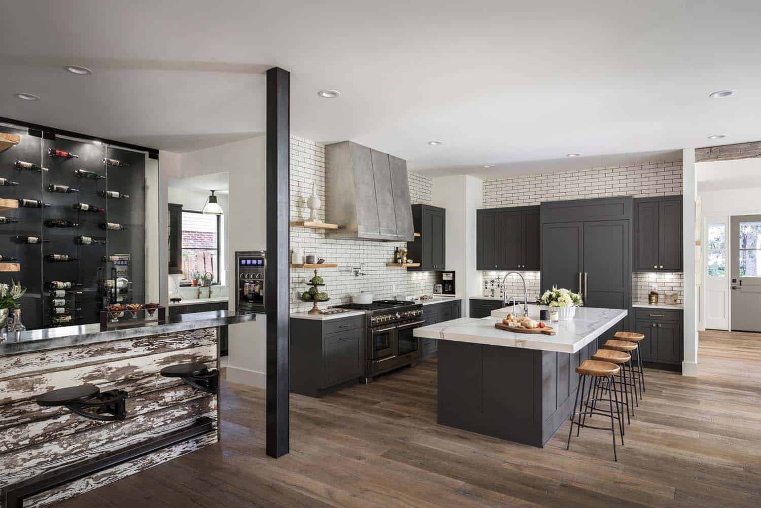
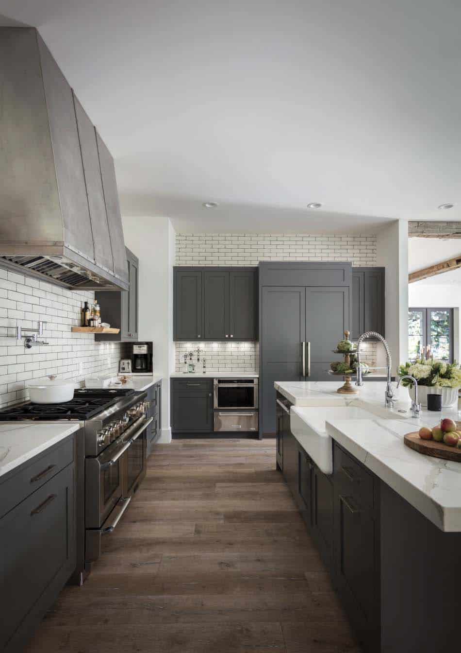
Above: The walls throughout this home are painted in Simply White OC-117 | Benjamin Moore. Of all the whites, this one is crisp and clean. The kitchen features subway tile walls sourced from Ann Sacks. Weld-Wright Fabricators is responsible for the exquisite custom built oven hood. They also designed the base for the wine-bar sink that is adjacent to the kitchen.
What We Love: This Napa Valley inspired farmhouse offers beautiful design details throughout. The architects have strived hard to create an effortless elegance that makes this home warm and inviting. We can just imagine how fabulous it would be to entertain in this home… or to be a kid in this home and enjoy the fantastic bedrooms! There are so many delectable design elements that would make anyone feel at home.
Tell Us: What are your thoughts on the design of this home. Are there any details you would like to have seen created differently? Please share your feedback below!
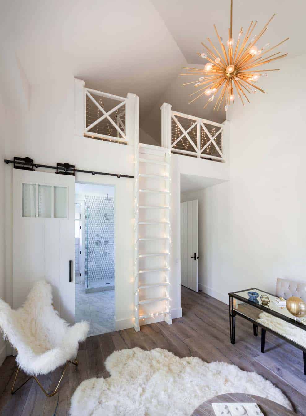
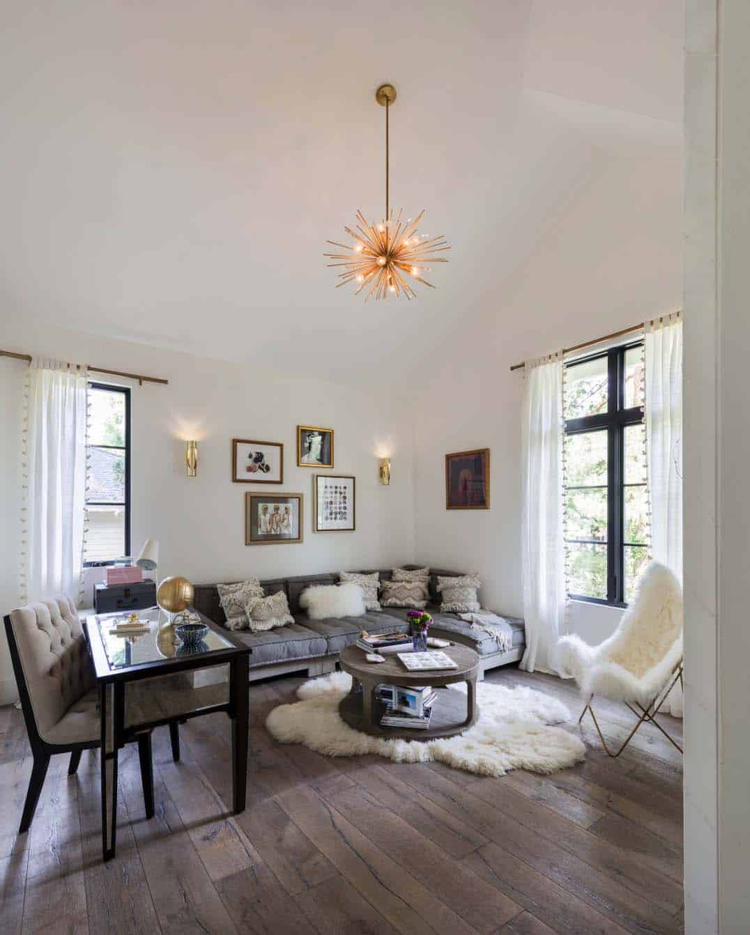
Above: The interior designer worked with the homeowner’s teenage daughter to create this chic space. Her inspiration for the bedroom was a New York loft feel.
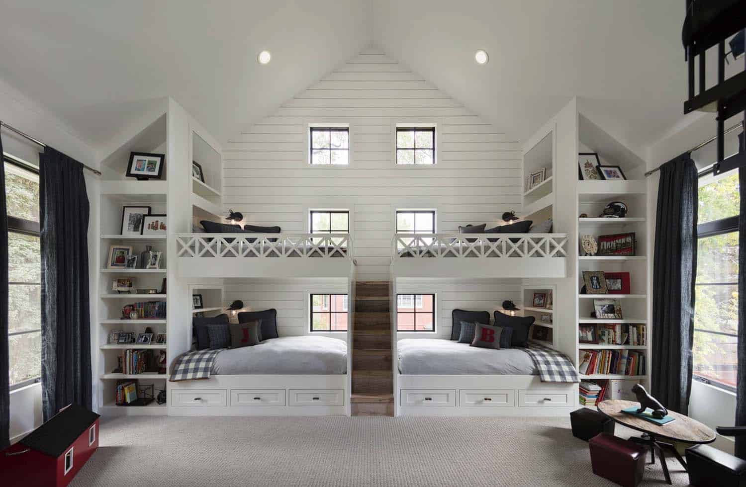
Above: A kid’s dream, this bunk bedroom is shared by two brothers, ages six and eight. The space features bunk beds with a small staircase access, cubbies and reading lamps. This room was one of the biggest inspirations for the design of this home. It began with a picture the homeowner shared with the architects. The house was designed from this image. Across from the bunk beds, a spiral staircase leads to a play loft. A hobbit door in the loft connects to their sister’s loft — which can be locked!
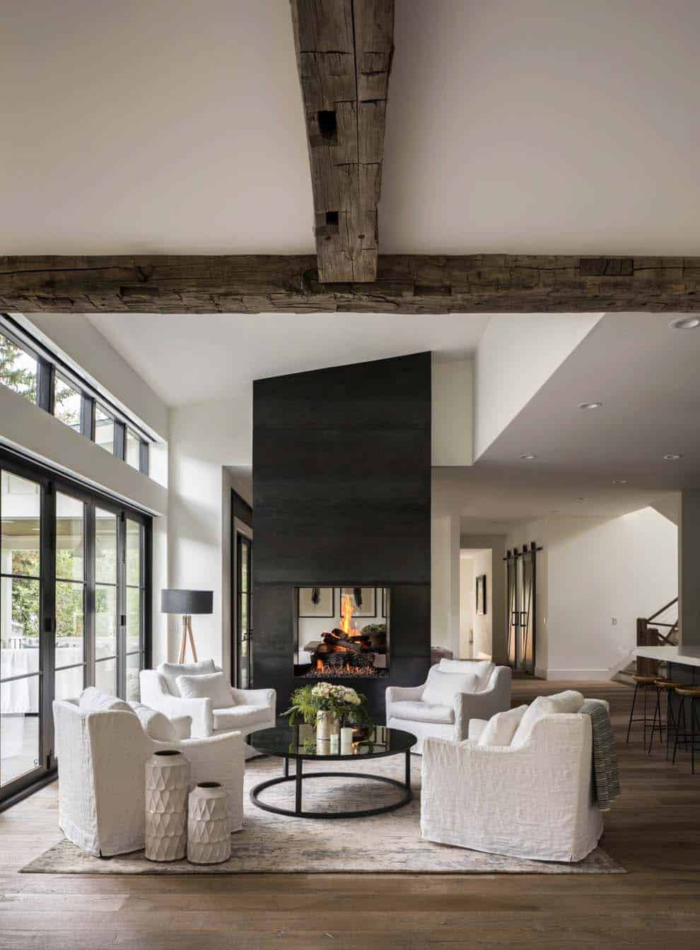
Above: In the living room, the blackened steel fireplace was designed by Distinctive Mantels. The design is inspired by the one at the St. Julien Hotel & Spa in Boulder, Colorado.
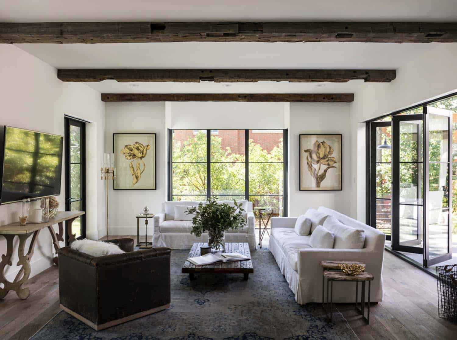
Above: The rustic ceiling beams in the living room were hand-selected, sourced from an old barn in Vermont. A pair of Sieger tulip prints accent the wall, while the vintage Palazzo rug was sourced from the Artisan Rug Gallery.
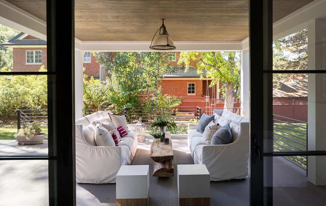
Above: This cozy outdoor living room features heaters installed in the ceiling for cooler temperatures. A custom designed coffee table is repurposed from an old elm tree that was cut down to build the home. The wood was kiln-dried for eight months to make not only the table but the kitchen shelves.
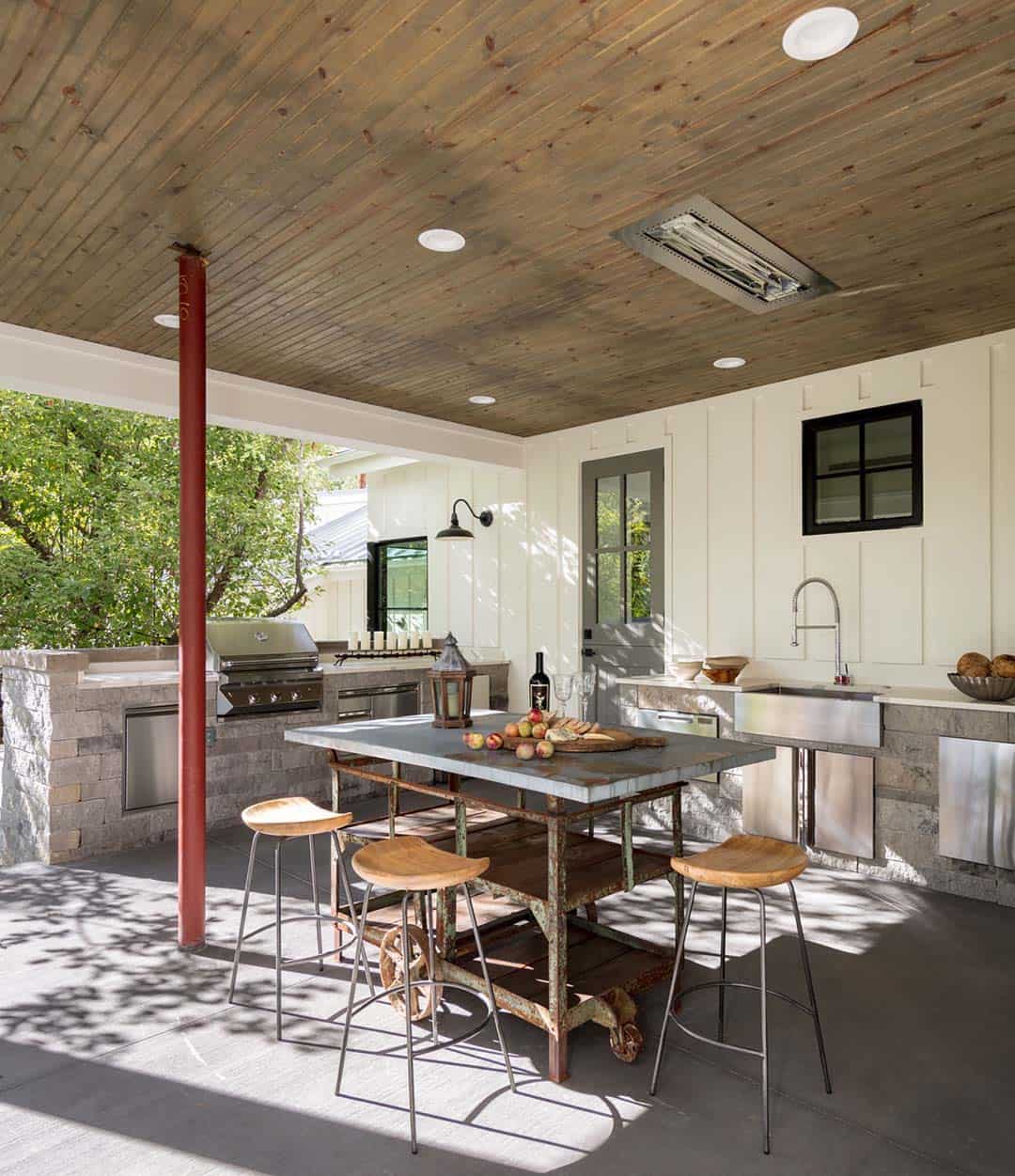
Above: The homeowner is an entrepreneur and entertains a lot for both business and non-profit work. There are two kitchens inside the home as well as this fully-loaded outdoor kitchen. This space includes a sink, fridge and dishwasher. The dining table is a reclaimed piece from an old trolly from the early 1900s. Sourced from a salvage shop, a zinc top was designed for it.
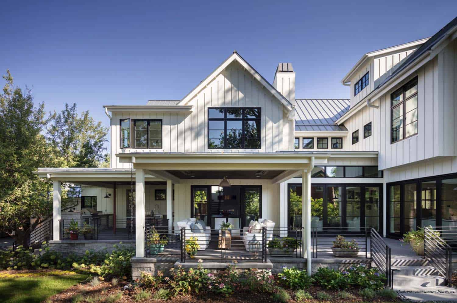
Above: The exterior facade of this home features a reverse board and batten siding. This creates additional airflow by holding the boards an inch away from the wall. The air behind the boards keeps them dry and stable through the seasonal elements. Additionally, the reverse method creates a 5/16-inch visual gap between the board edges, giving an attractive shadow line.
Photos: David Lauer



2 comments