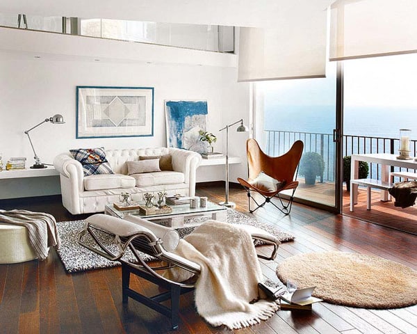
Light and enviable views filled with charm describe this home located in Cap Sa Sal, Begur, a small village in Spain. These two features were precisely those that marked the reform planned by interior designer Pia Capdevila. This was a conventional home, which was transformed into an open and comprehensive space. The considerable height of the ceiling in some areas of the house took advantage to gain a second floor, distributed in various environments visually connected. The area was organized into two well-defined areas: the day and the rest.
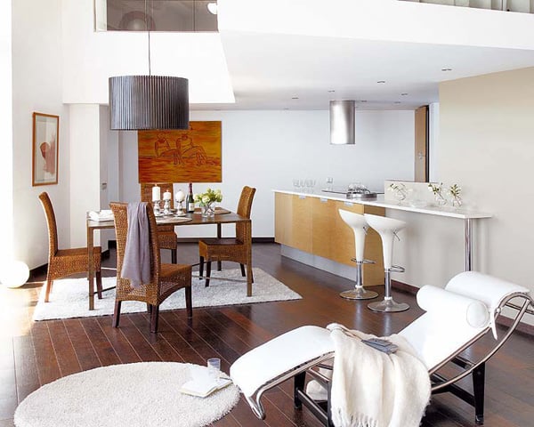
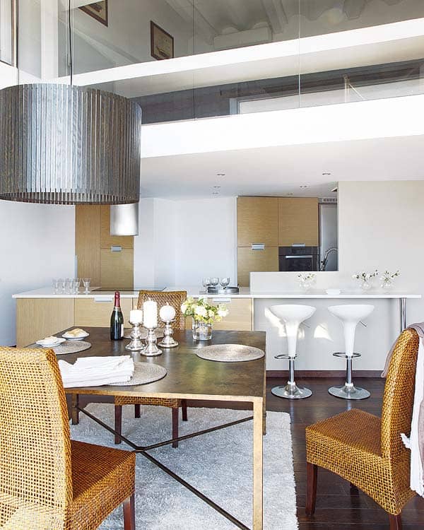
The living room, dining room and the kitchen share the same space without divisions, with materials such as dark wooden flooring, and large windows that strain the intense blue of the sea. In the kitchen and the living area white is the color protagonist, while the dining room took on a different style, with parts in dark shades. The loft, which extends over part of the hall and hosts a bedroom, creates a clever and rewarding level playing on lights and shadows.
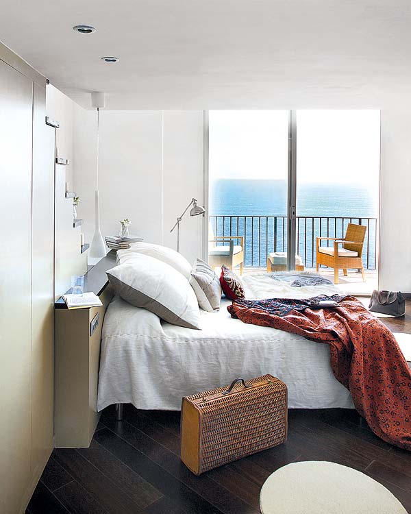
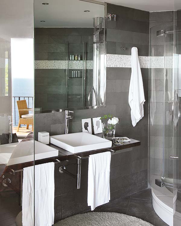
The integration of the outside is a constant in every room of the house, and the designer wanted to be also very present in the master bedroom. To this end it was distributed so that both the sleeping area and bathroom receive natural light. In the master bedroom, behind the built-in headboard are stairs that leads to an attic. The walls of the bathroom were replaced by a clever glass enclosure to allow natural light to penetrate the space. Integrated fully into the bedroom, in this space it is possible to enjoy a shower with a view to the horizon. The bathroom is a private oasis, decorated with black tiles alternated with supplements in white. Ultimately, the quality of the finishes chosen for reform, the balanced arrangement of the furniture in all the housing and the right distribution of simple lines become hallmarks of the sophisticated style that defines this decoration project.
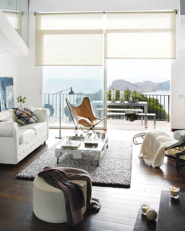
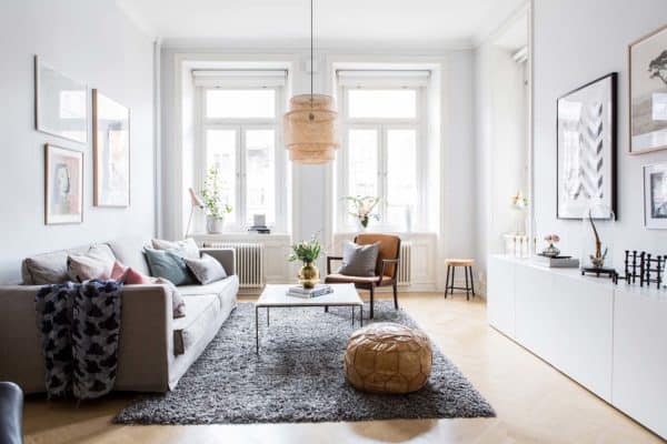
The large window frames the living area, designed as a space of refined and restrained, lines without fanfare ornamental. To maintain this effect, the space has been accented with furniture of high volume. Only a shelf behind the sofa serves as a support for books and a couple of tables.
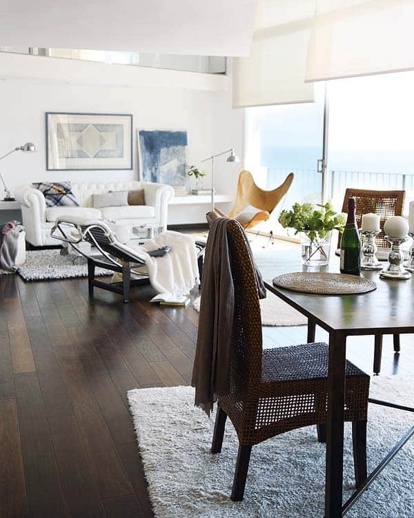
The dark tone of the table and the rattan chairs acquired prominence and volume on the white stage; everything is culminated by the prominent light fixture made with wood slats that match the tone of the flooring.
The solid wood flooring acts as an element to connect the spaces throughout the home. The predominant white walls, textiles and furniture contrasts with the intensity of the smoked oak material that was chosen. For this reason all the carpets were chosen in neutral tones, as seen in the dining room which marks the transition between spaces.
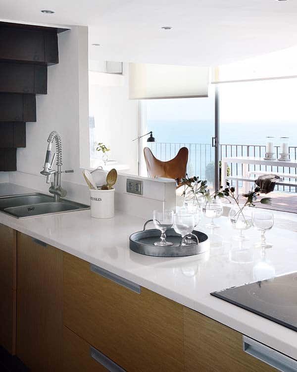
The kitchen enjoys a panoramic landscape. Its design was established in line with the rest of spaces as a work and meeting place open to the dining room and lounge.
Under the stairs by which you can access the attic, Pia Capdevila devised a custom made and hand painted dressing room, which extends in a wall that limits the space.
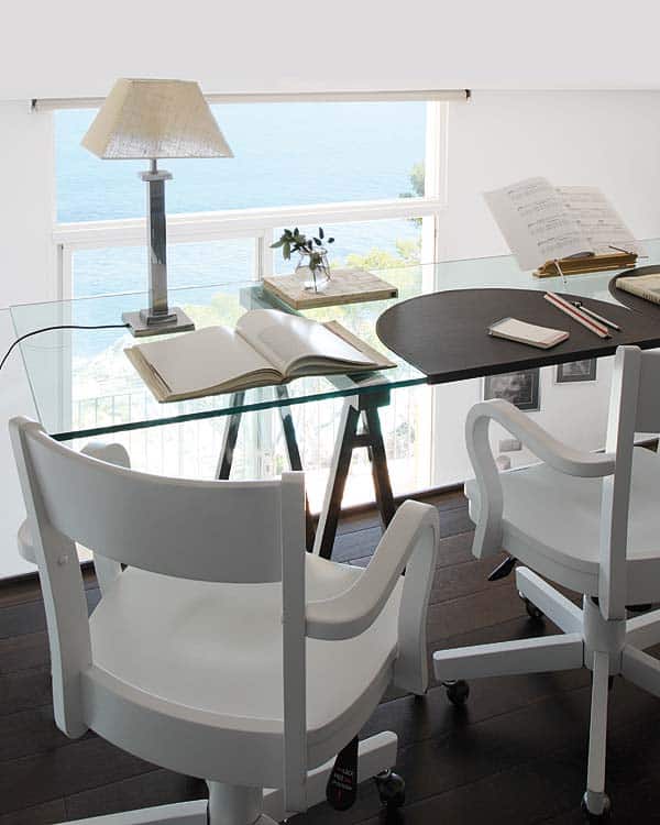
From the bedroom there is access to the attic in which the office is located. Its design and finishes have been carefully chosen. The dressing room panel is in varnished oxide and the steps are of smoked oak wood, the parquet brings elegance and sobriety to the space.
On the top floor lies a desktop of glass mixed with chrome, custom designed by Pia Capdevila.
A glass enclosure delimits the bathroom without subtracting natural light. This election, although deprived of privacy, has allowed the walls and floor to be tiled in darker hues. A frieze of stones of river crosses the wall.
Photos: Mi Casa




1 comment